Sara L. Walker Portfolio | Redo
17901
wp-singular,portfolio_page-template-default,single,single-portfolio_page,postid-17901,wp-theme-bridge,qode-quick-links-1.0,,qode-page-loading-effect-enabled, vertical_menu_transparency vertical_menu_transparency_on,qode-title-hidden,qode_grid_1300,side_menu_slide_from_right,qode-theme-ver-17.1,qode-theme-bridge,disabled_footer_top,disabled_footer_bottom,wpb-js-composer js-comp-ver-7.9,vc_responsive
Project Details
Redo is the interior design venture of artist, curator, and design expert Kathy P. Thompson. A known name in the tight knit artist town of Fayetteville, Arkansas, Kathy wanted to extend her expansive knowledge of design to her local community, helping people realize their interior and exterior goals. Kathy believes that with the right eye, a few simple changes to a space, whether switching upholstery, changing paint color, or rearranging furniture, can make a big impact.
I was tasked with creating a visual identity that would embody Kathy’s personal style and process. Beginning with the logo design, all elements of the brand are rooted in the idea of fluid movement and invites people to interact with each piece.
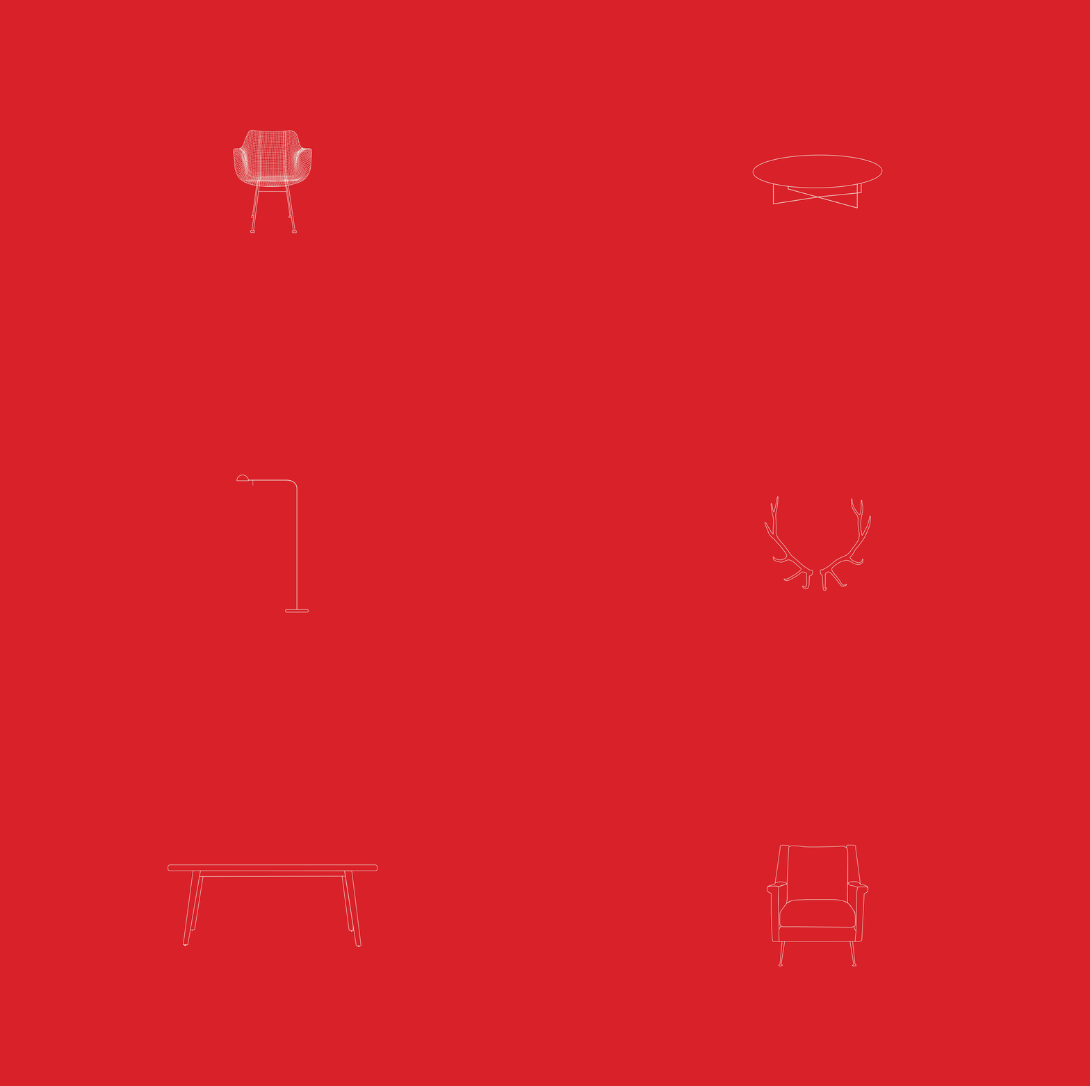
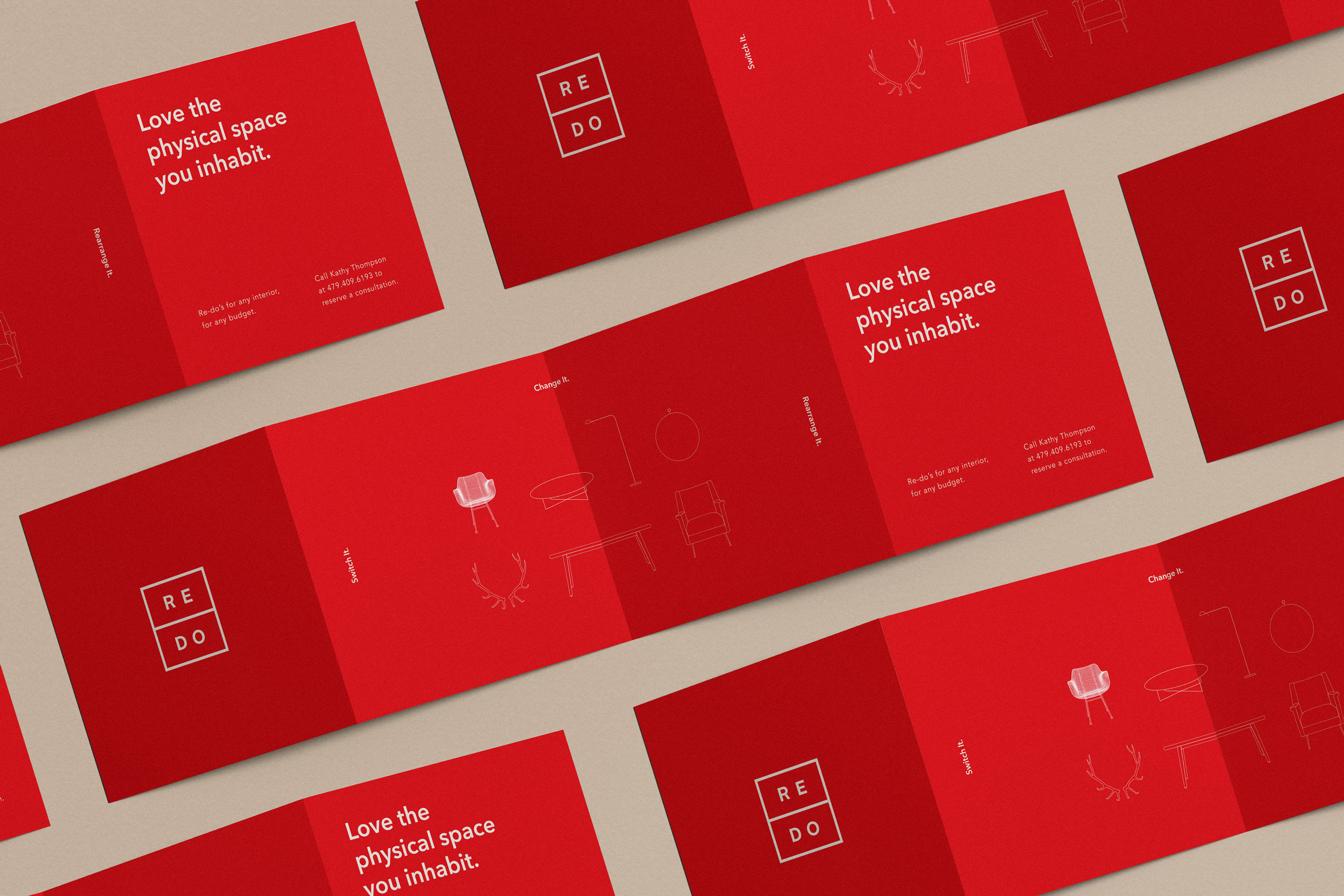
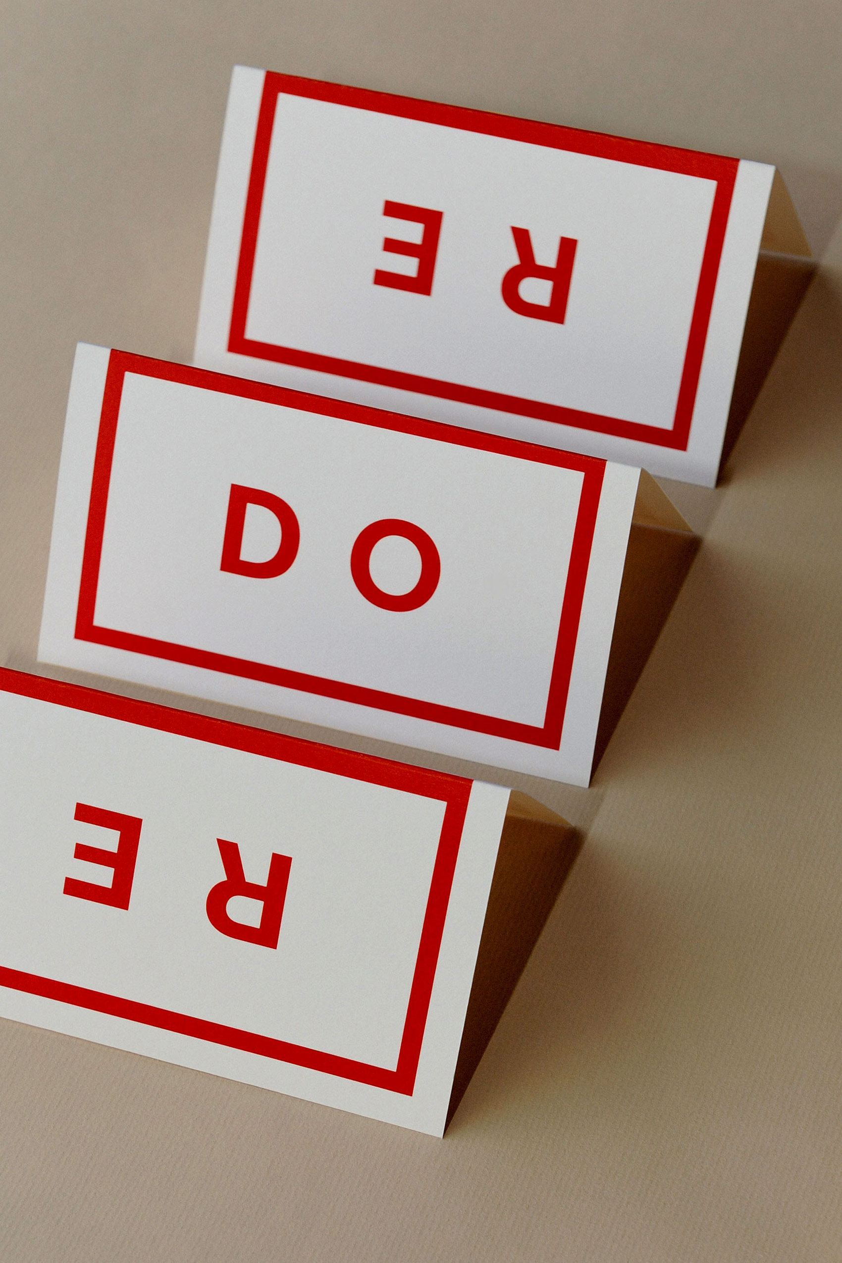
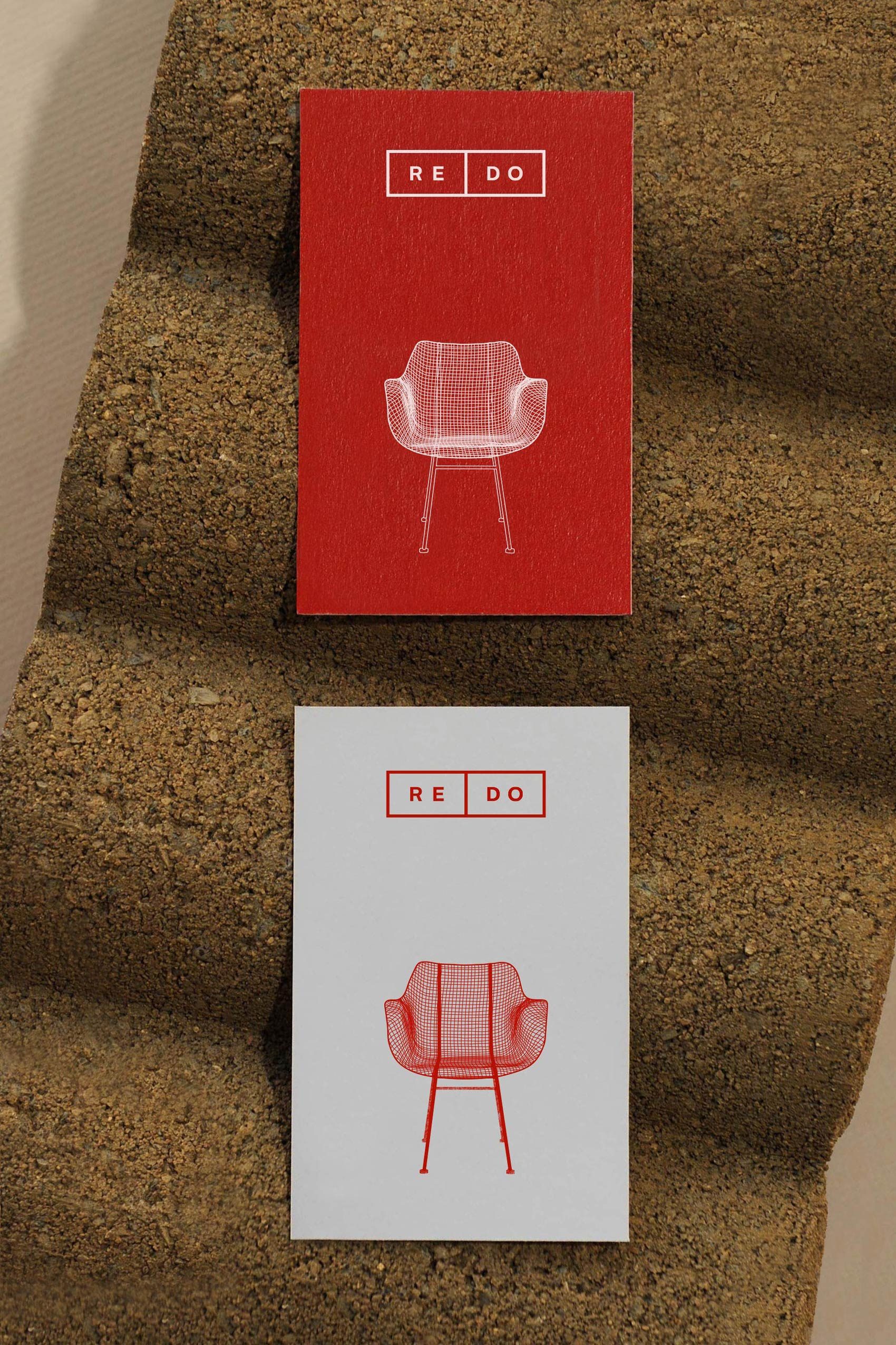
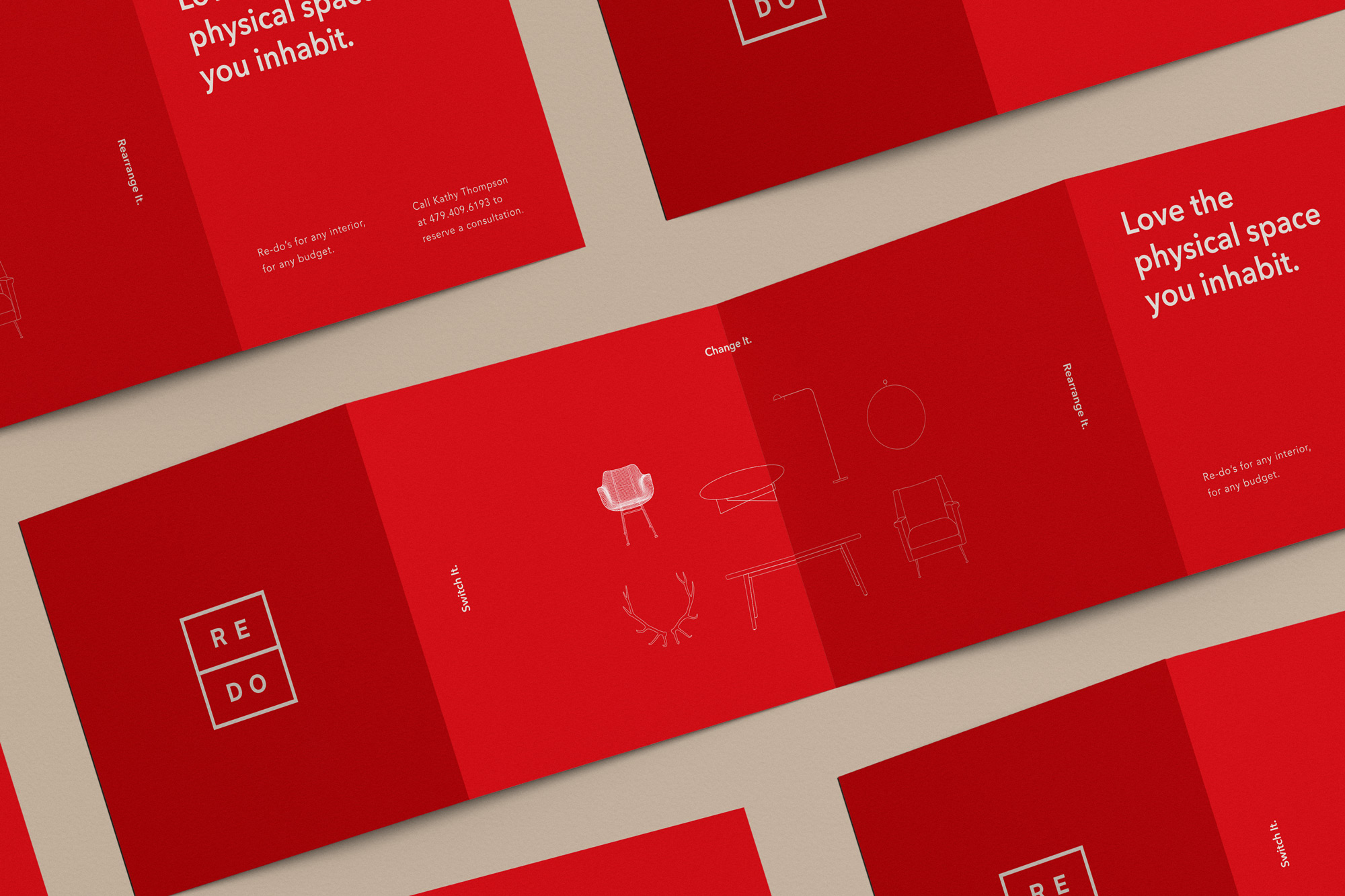
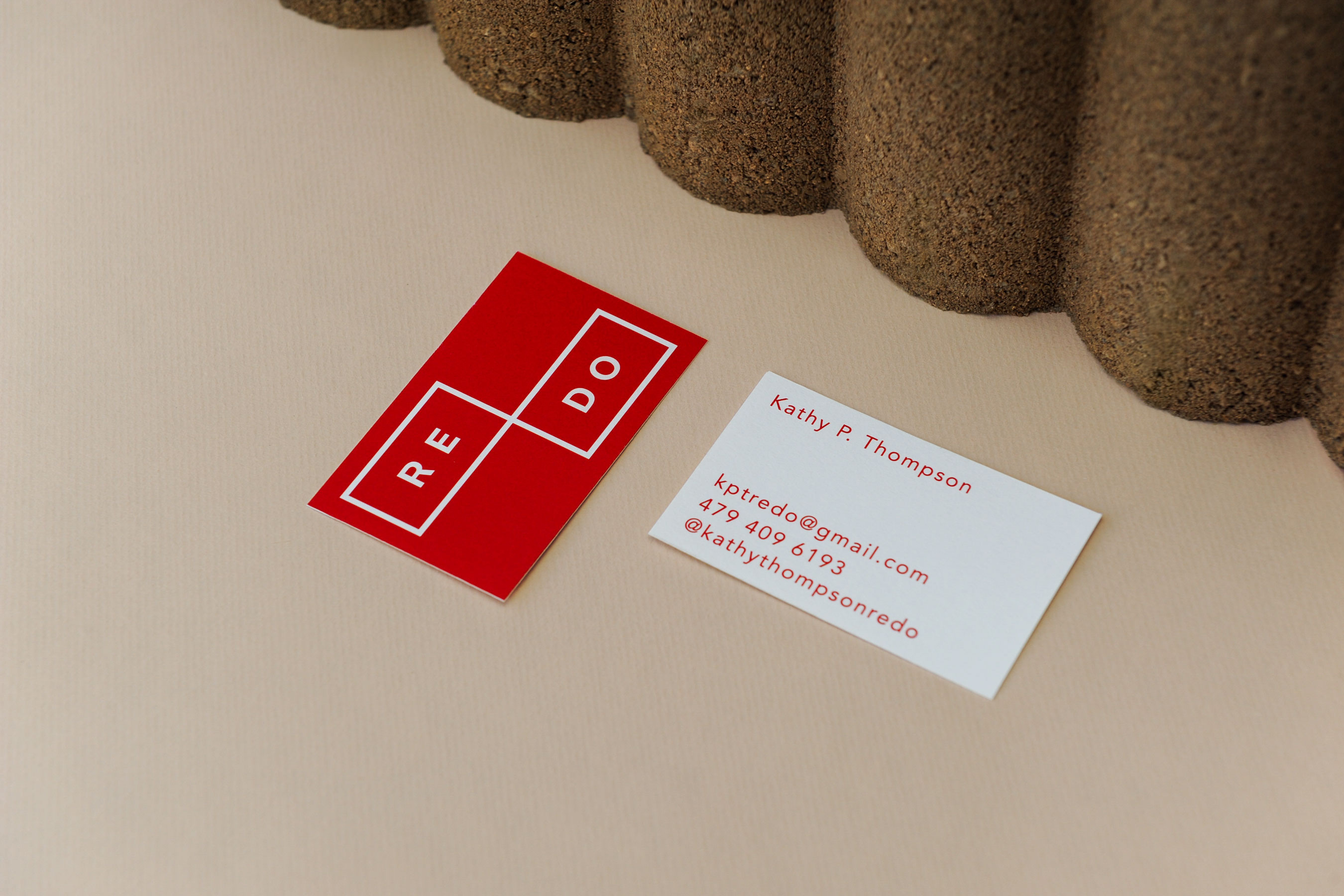
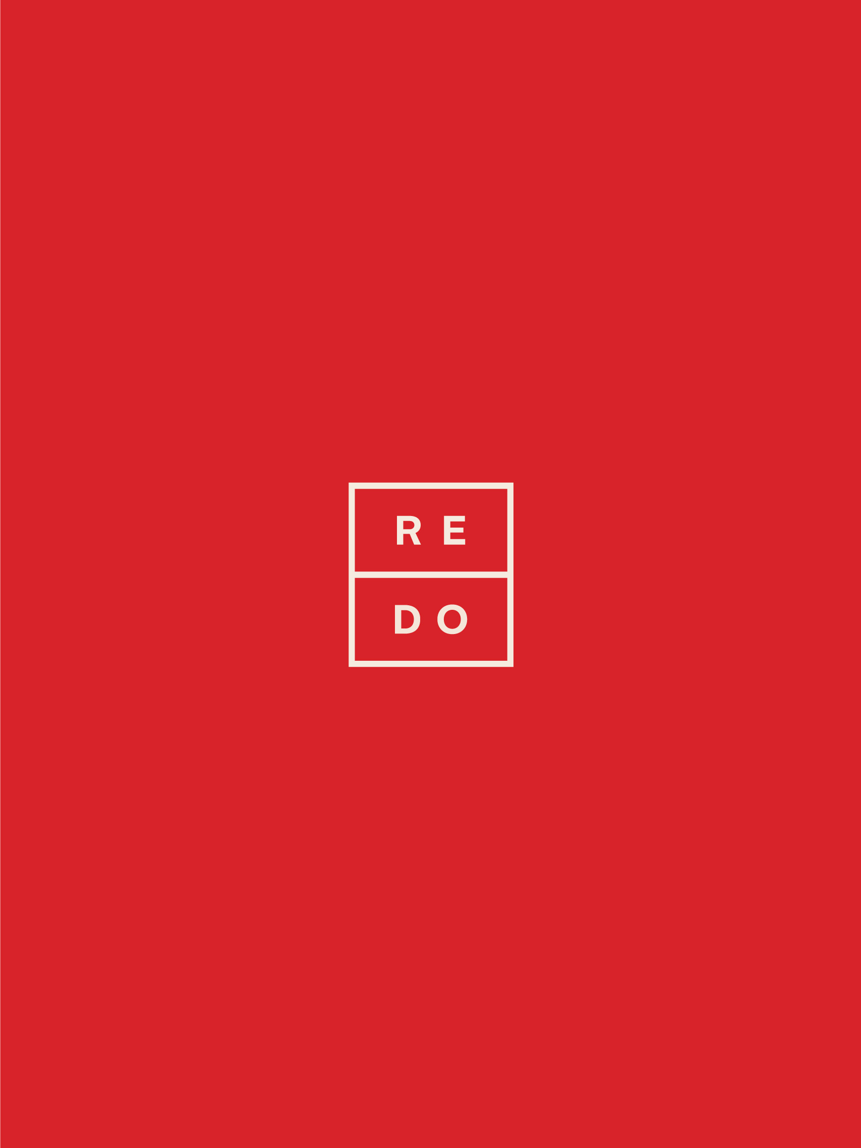
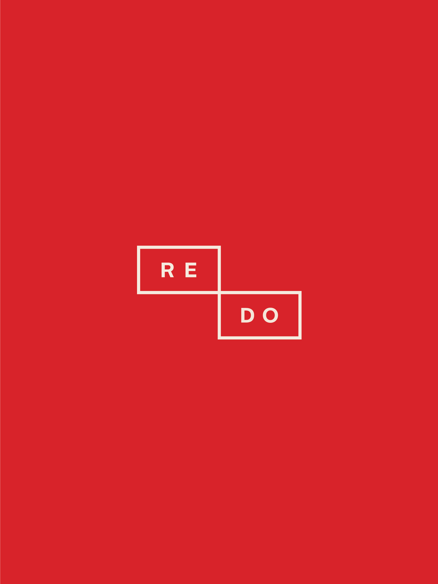
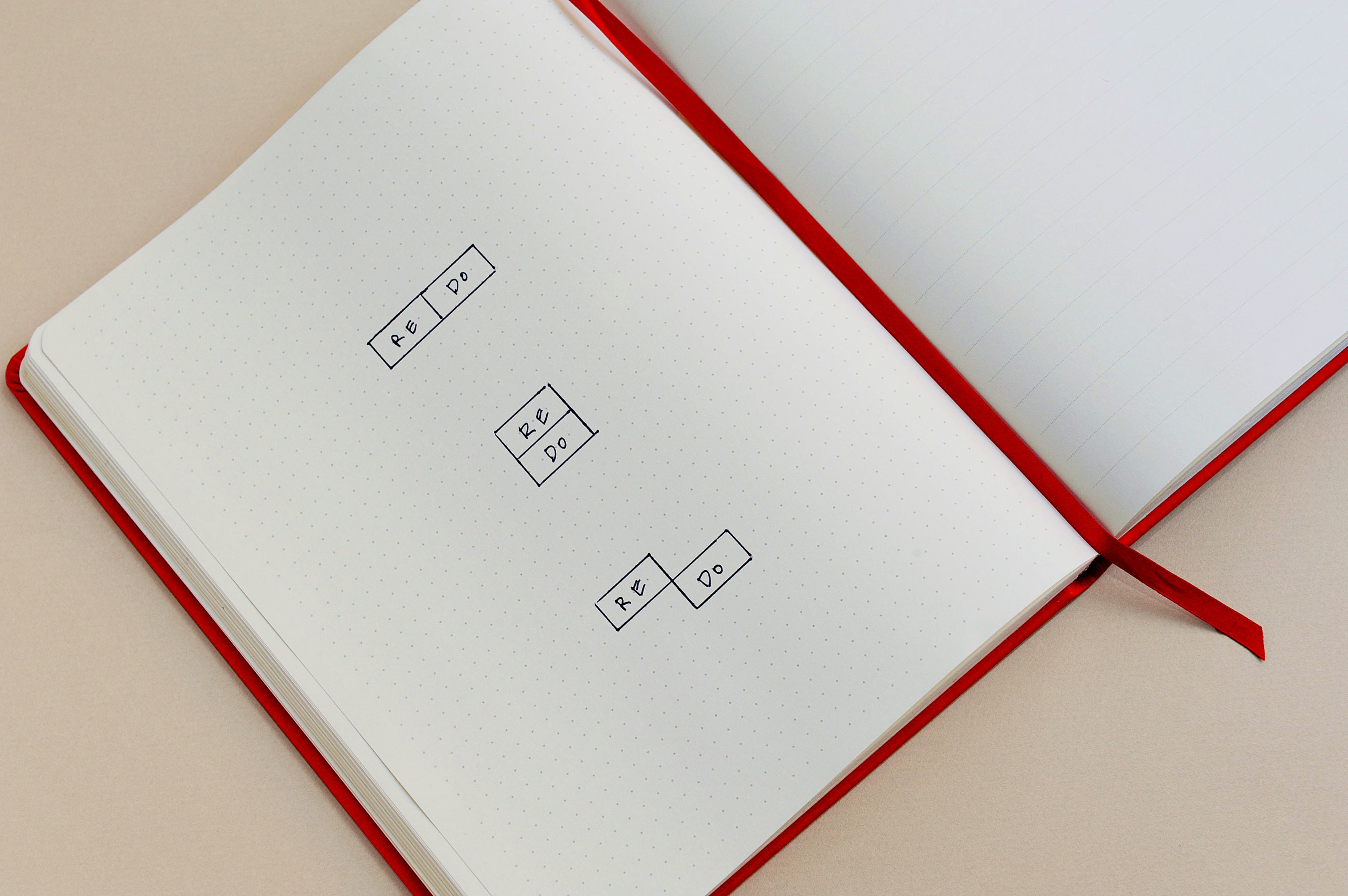
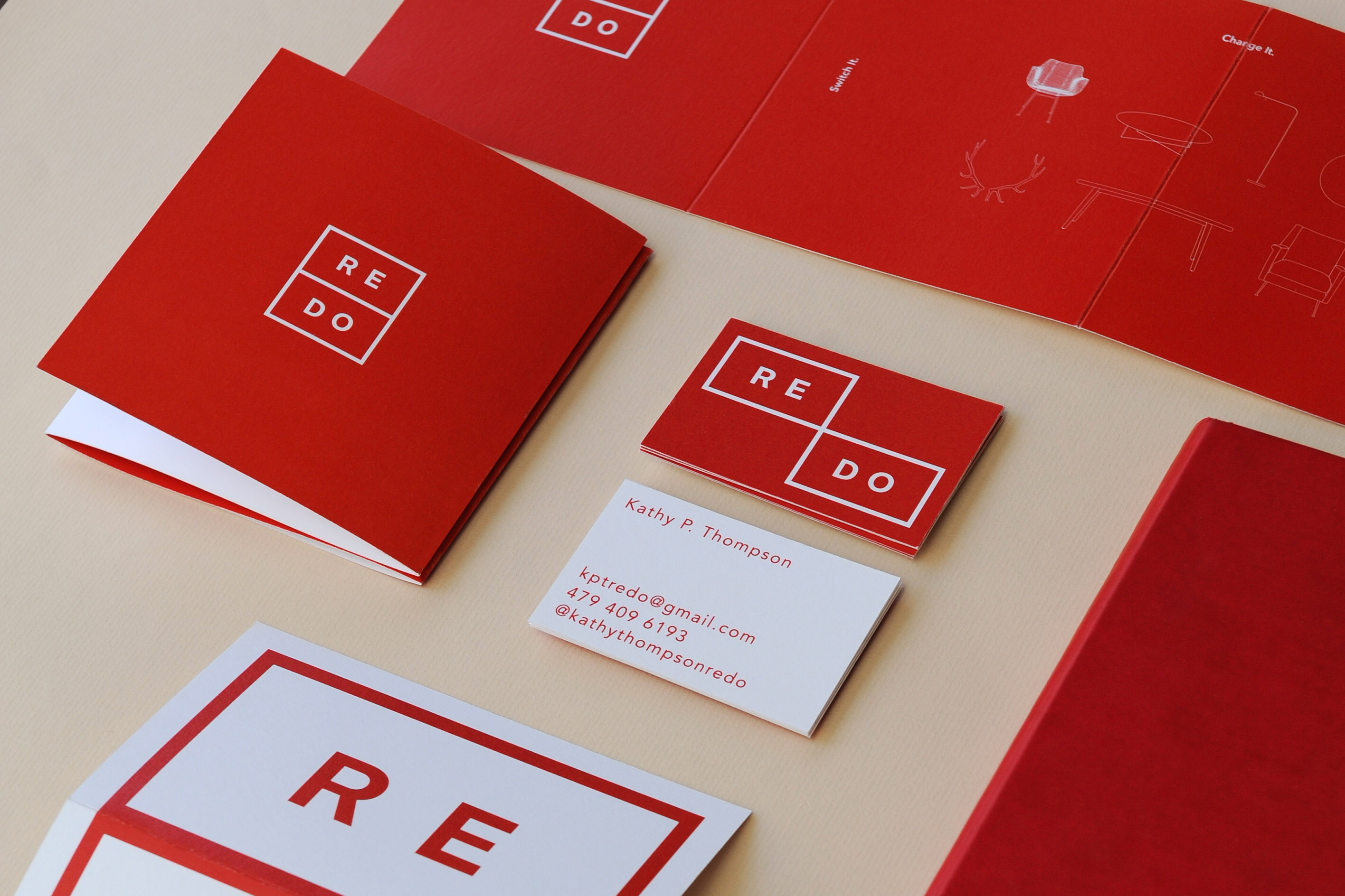
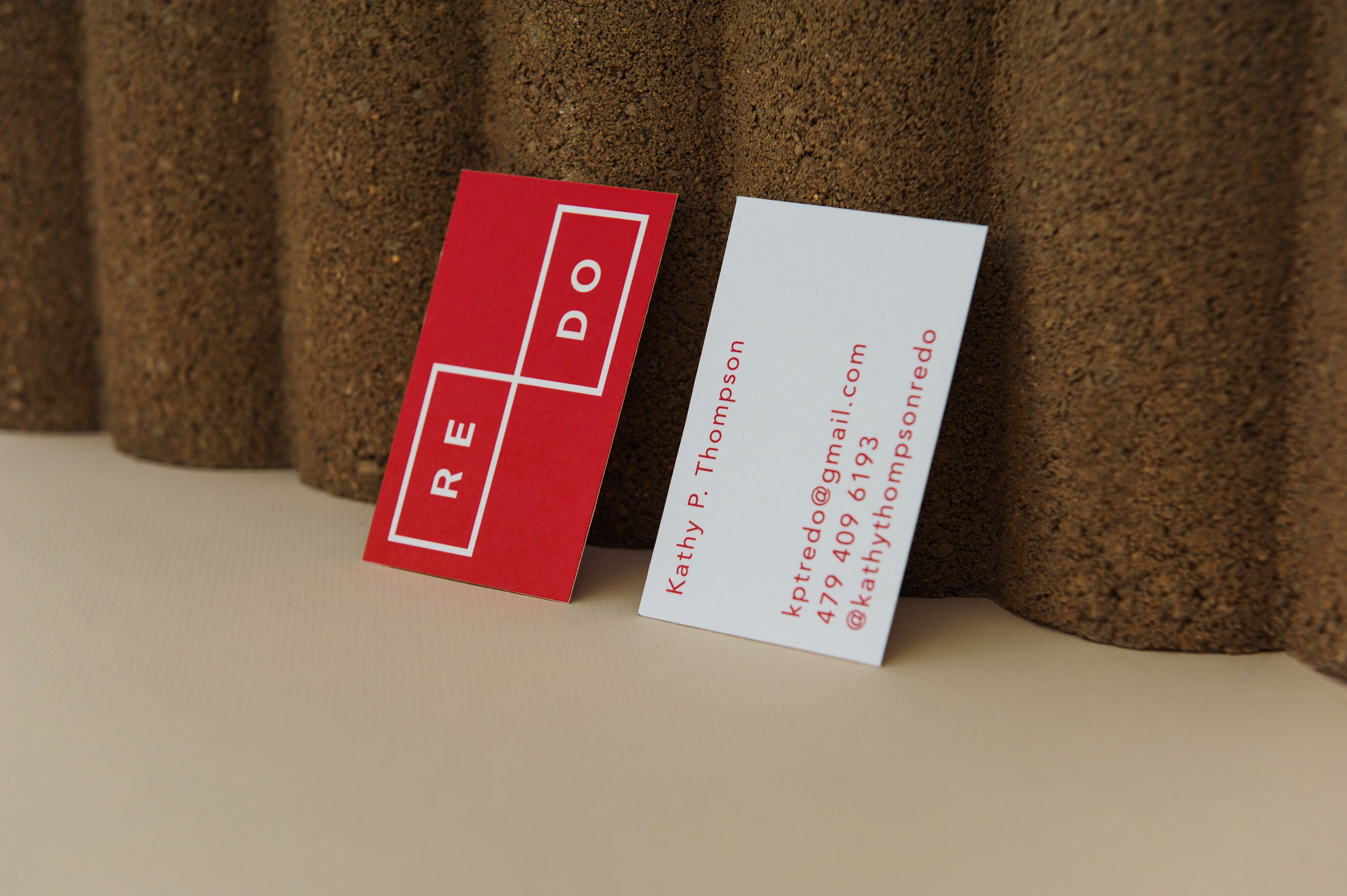
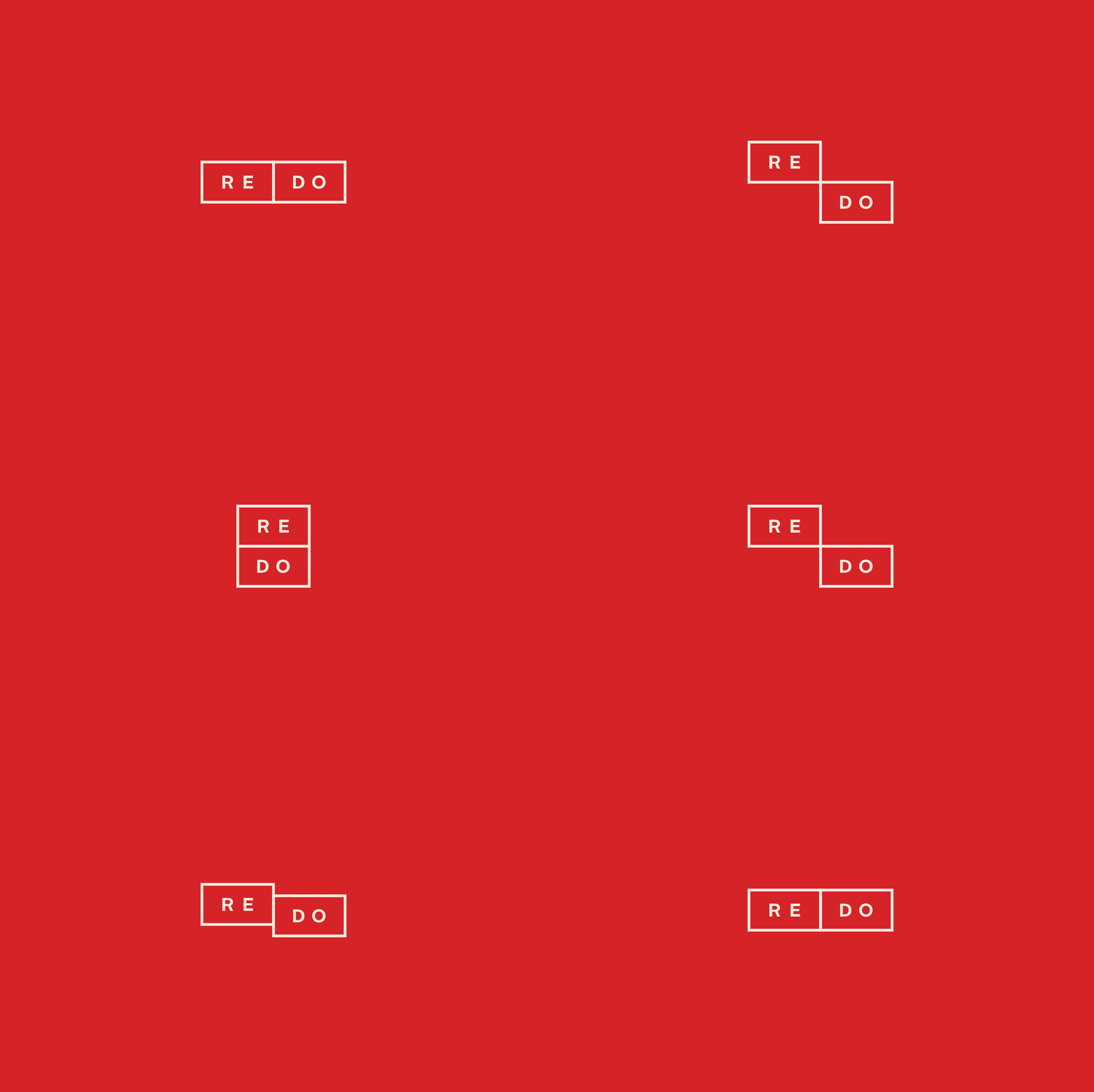
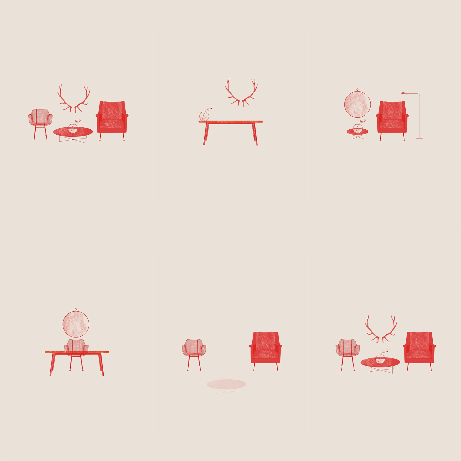
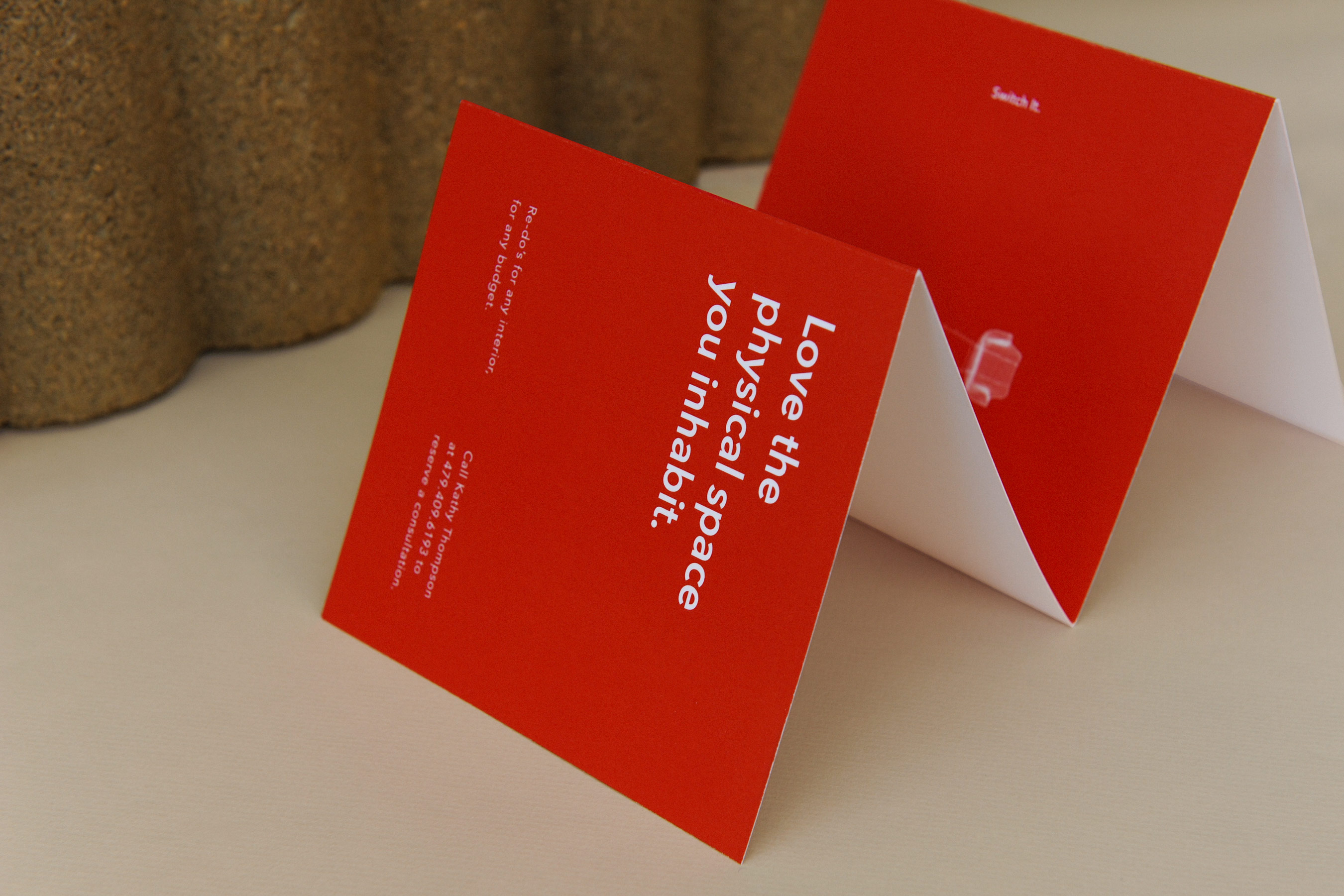
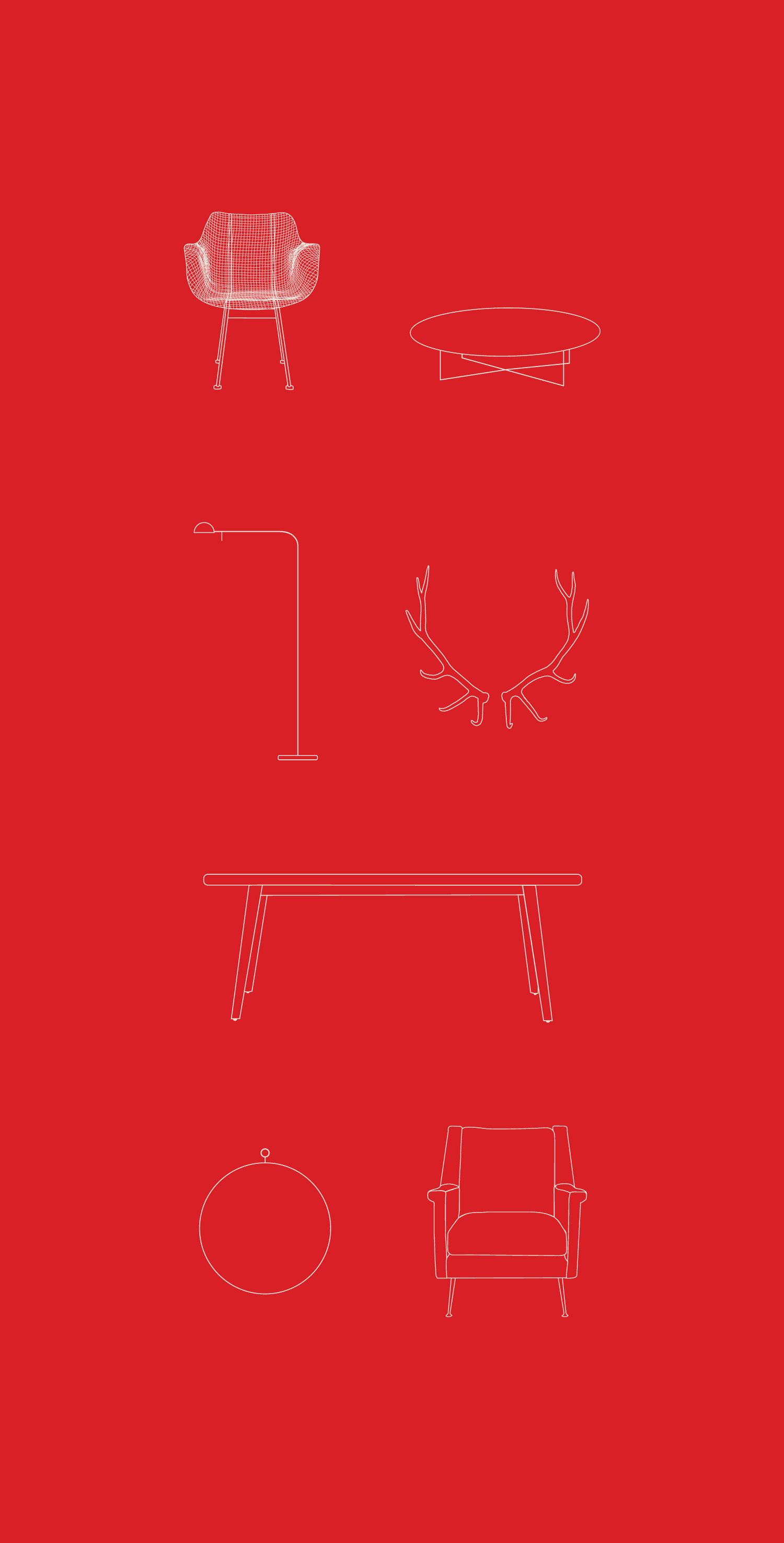
A contemporary logotype is separated into two pieces and contained within a modular grid, that is able to be rearranged into several configurations. Her printed materials showcase all three versions of the logo as well as a set of custom furniture iconography. Animation is used as a tool in this project for digital media, to further push the idea of fluid motion, showing the logo reconfigure and the furniture icons rearrange themselves.
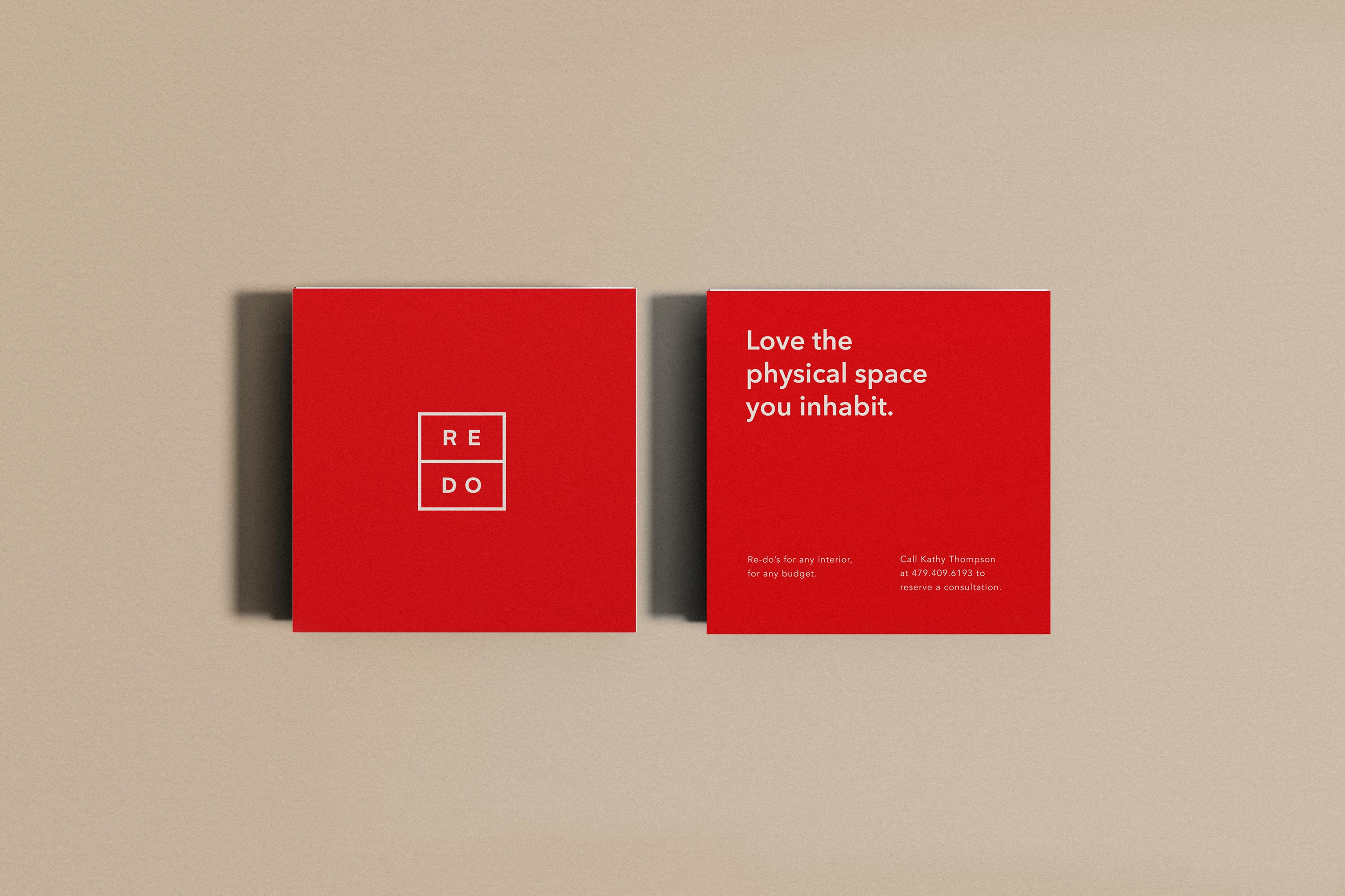
Simple layouts and a monochromatic red palette are used across the brand, creating a playful yet no-fluff vibe that expresses Kathy’s down-to-earth approach.
Tasks
Brand Identity, Printed Materials,
Illustration, Animation

Redo
Redo is the interior design venture of artist, curator, and design expert Kathy P. Thompson. A known name in the tight knit artist town of Fayetteville, Arkansas, Kathy wanted to extend her expansive knowledge of design to her local community, helping people realize their interior and exterior goals. Kathy believes that with the right eye, a few simple changes to a space, whether switching upholstery, changing paint color, or rearranging furniture, can make a big impact.
I was tasked with creating a visual identity that would embody Kathy’s personal style and process. Beginning with the logo design, all elements of the brand are rooted in the idea of fluid movement and invites people to interact with each piece.
A contemporary logotype is separated into two pieces and contained within a modular grid, that is able to be rearranged into several configurations. Her printed materials showcase all three versions of the logo as well as a set of custom furniture iconography. Animation is used as a tool in this project for digital media, to further push the idea of fluid motion, showing the logo reconfigure and the furniture icons rearrange themselves.
Simple layouts and a monochromatic red palette are used across the brand, creating a playful yet no-fluff vibe that expresses Kathy’s down-to-earth approach.
Tasks
Brand Identity, Printed Materials,
Illustration, Animation


Get in touch
Copyright Sara L. Walker.
