Project Details
Save Our Sei is a fictional non-profit organization that I created for a college assignment, which required forming a mission statement and visual identity for an organization in support of the endangered species of our choosing. I was attracted to the powerful yet tranquil nature of the Sei Whale and wanted to design a brand identity with those attributes in mind throughout.
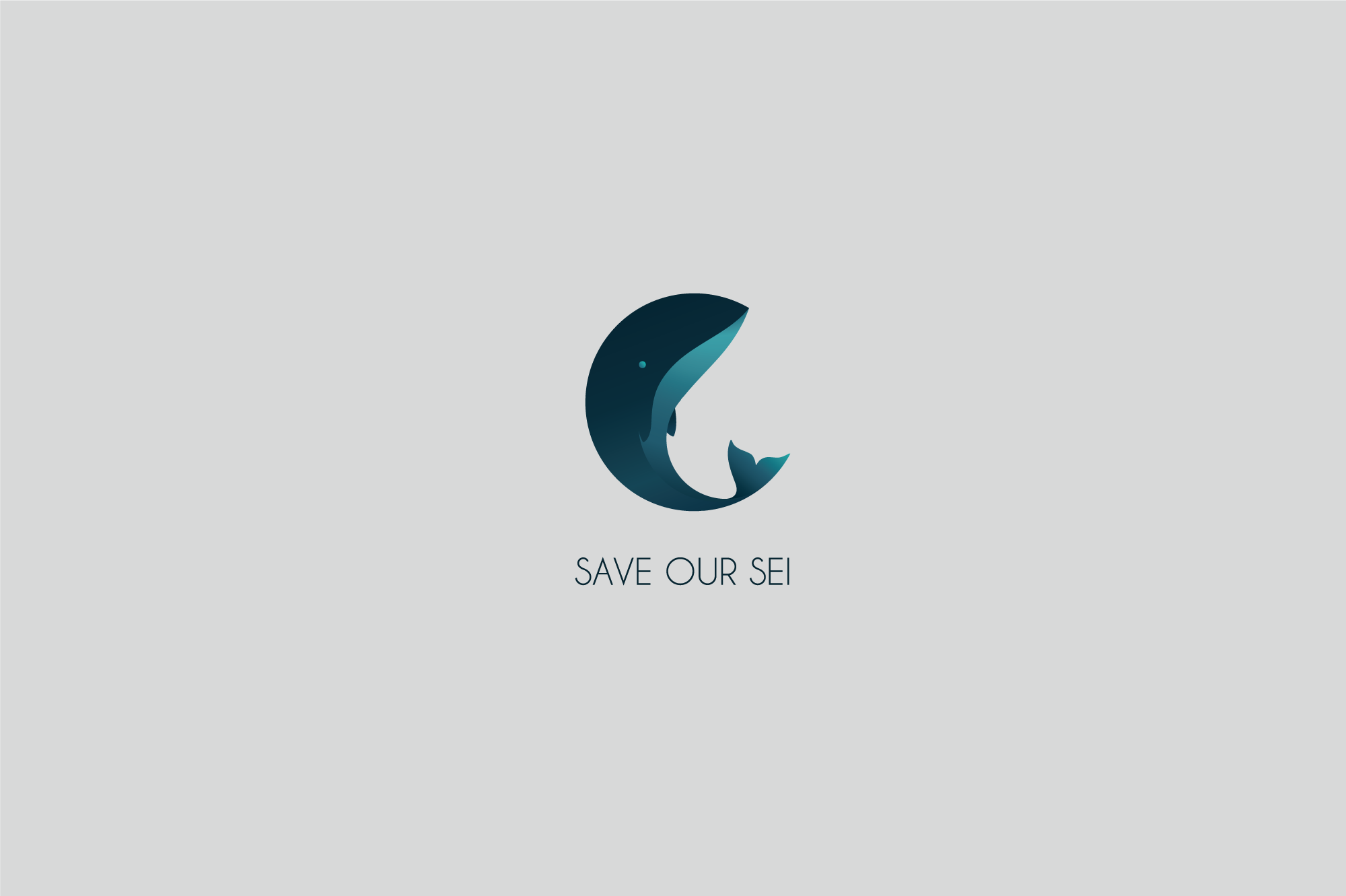
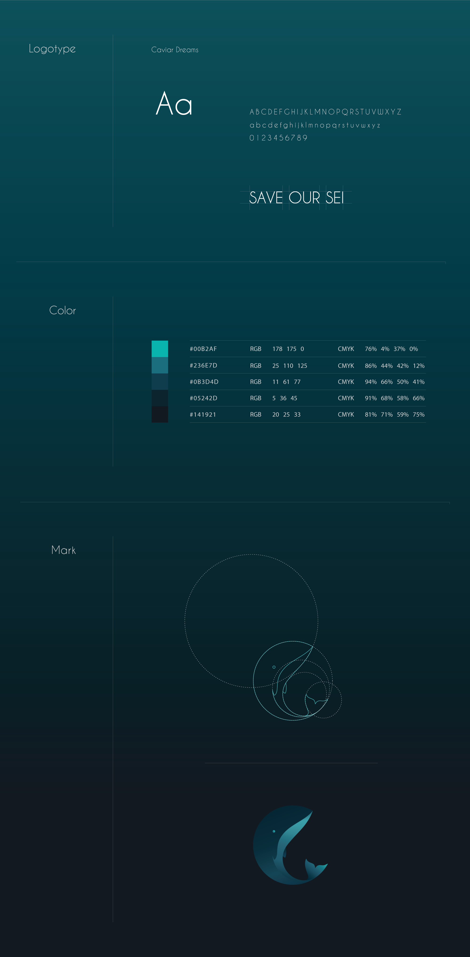
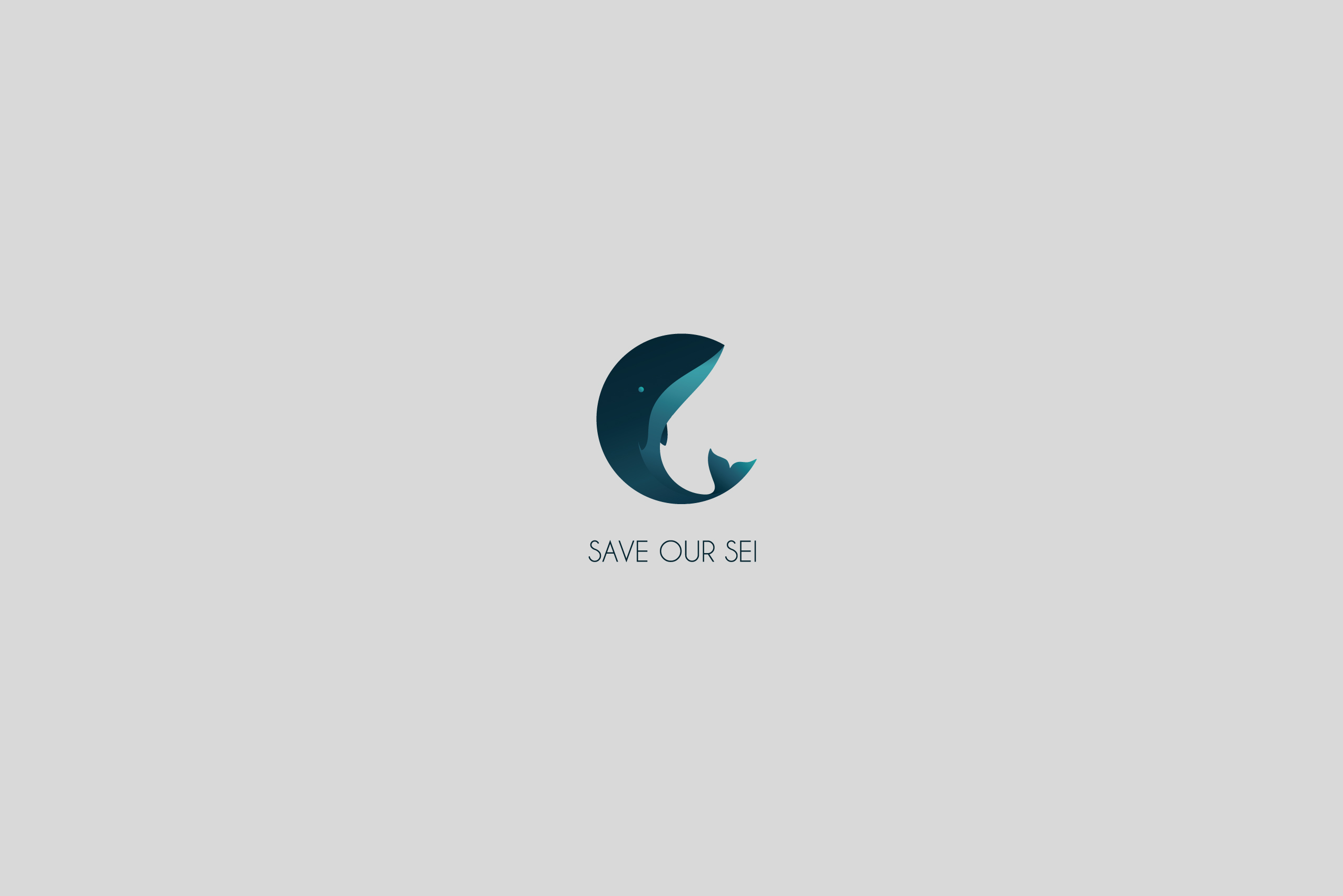
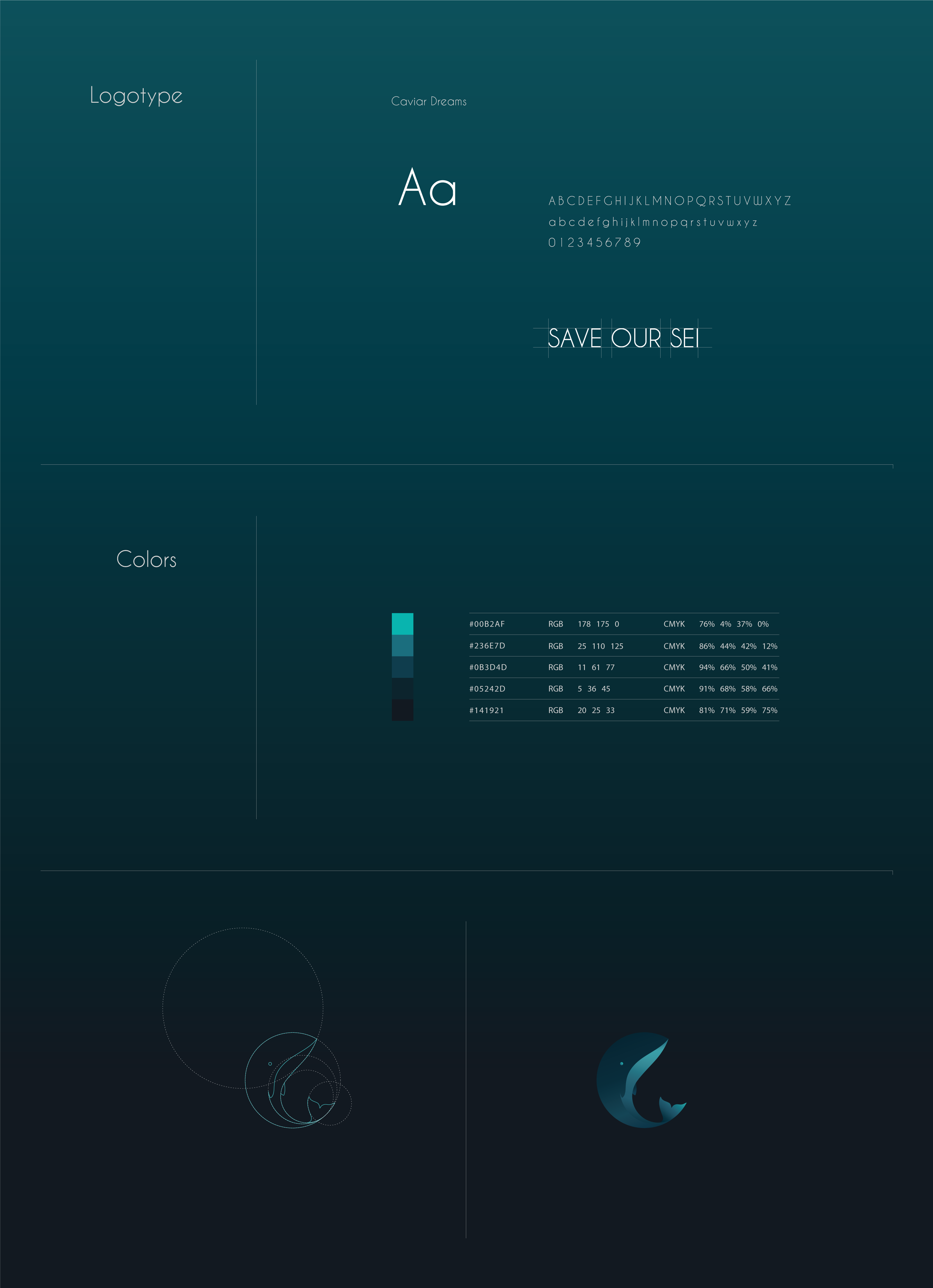
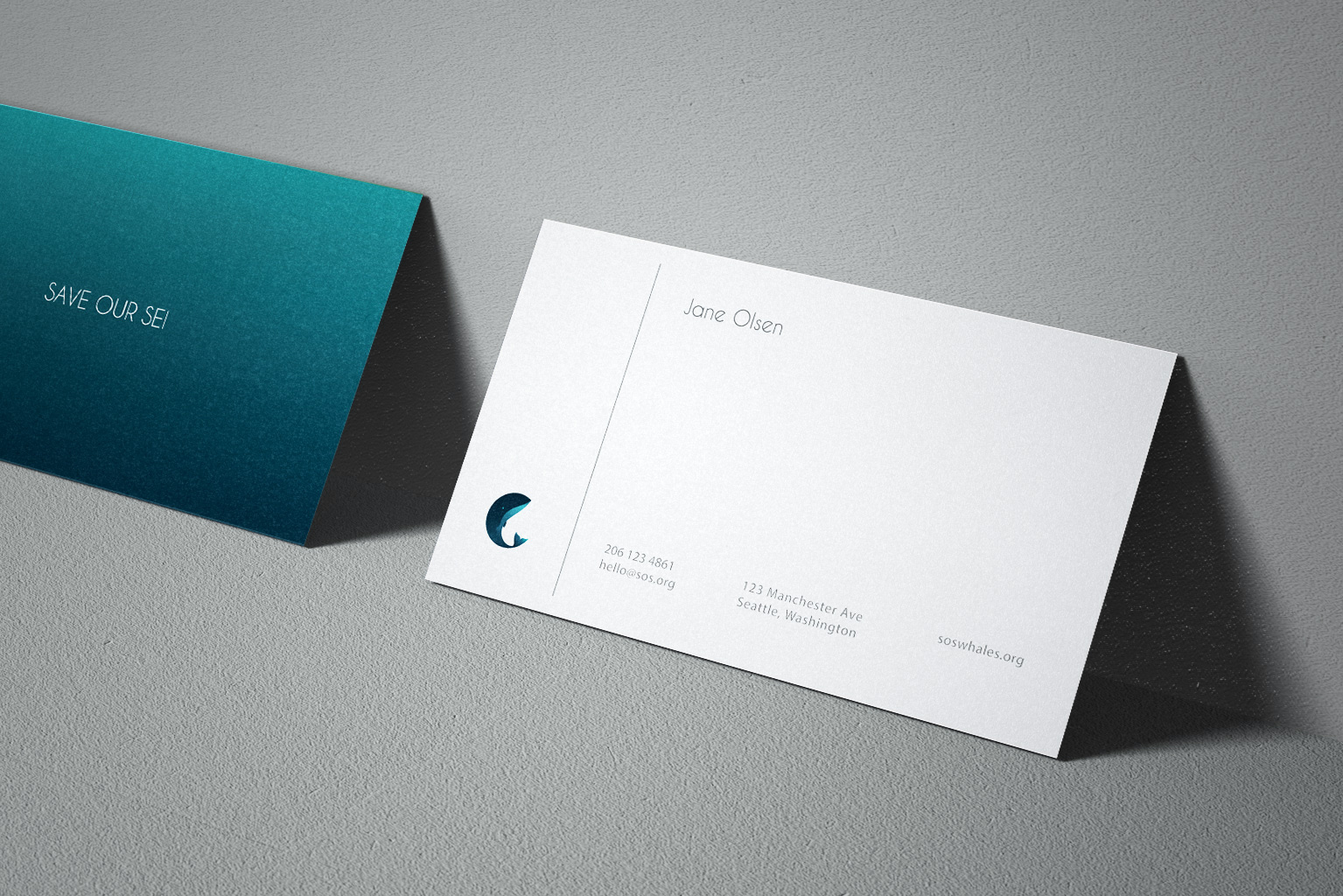
The circle was important to the process of this project, not only to create a neat final logo that fits well into a variety of spaces, but also to echo the fluid movement and shape of the whale and the Earth. Nautical yet minimalistic Cavier Dreams was chosen for the logotype, and is also used for titles in the info book and other printed materials.
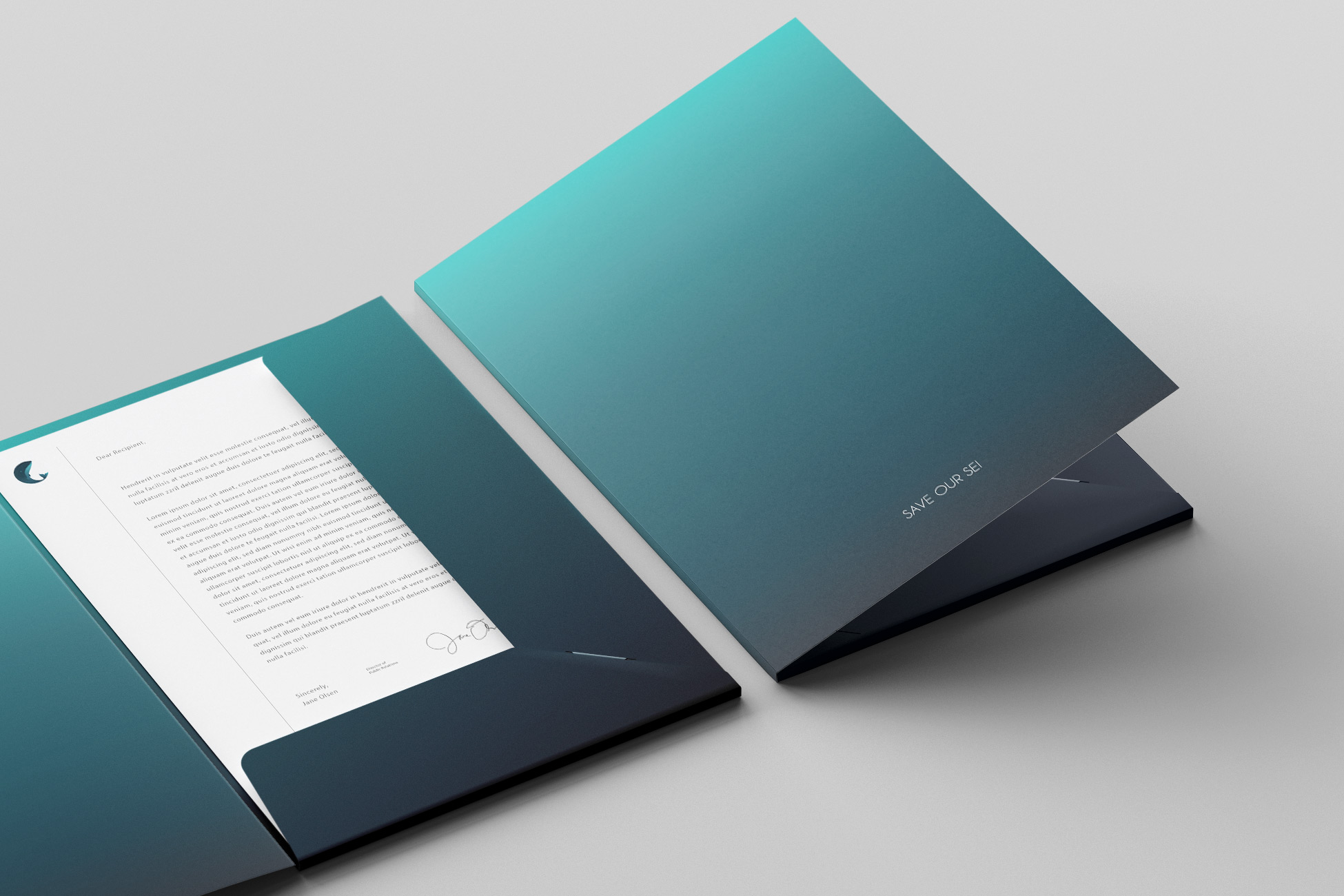
The ocean’s depth inspires a gradient palette of blues used for the logo and throughout the brand, accompanied by minimalist grey and white.
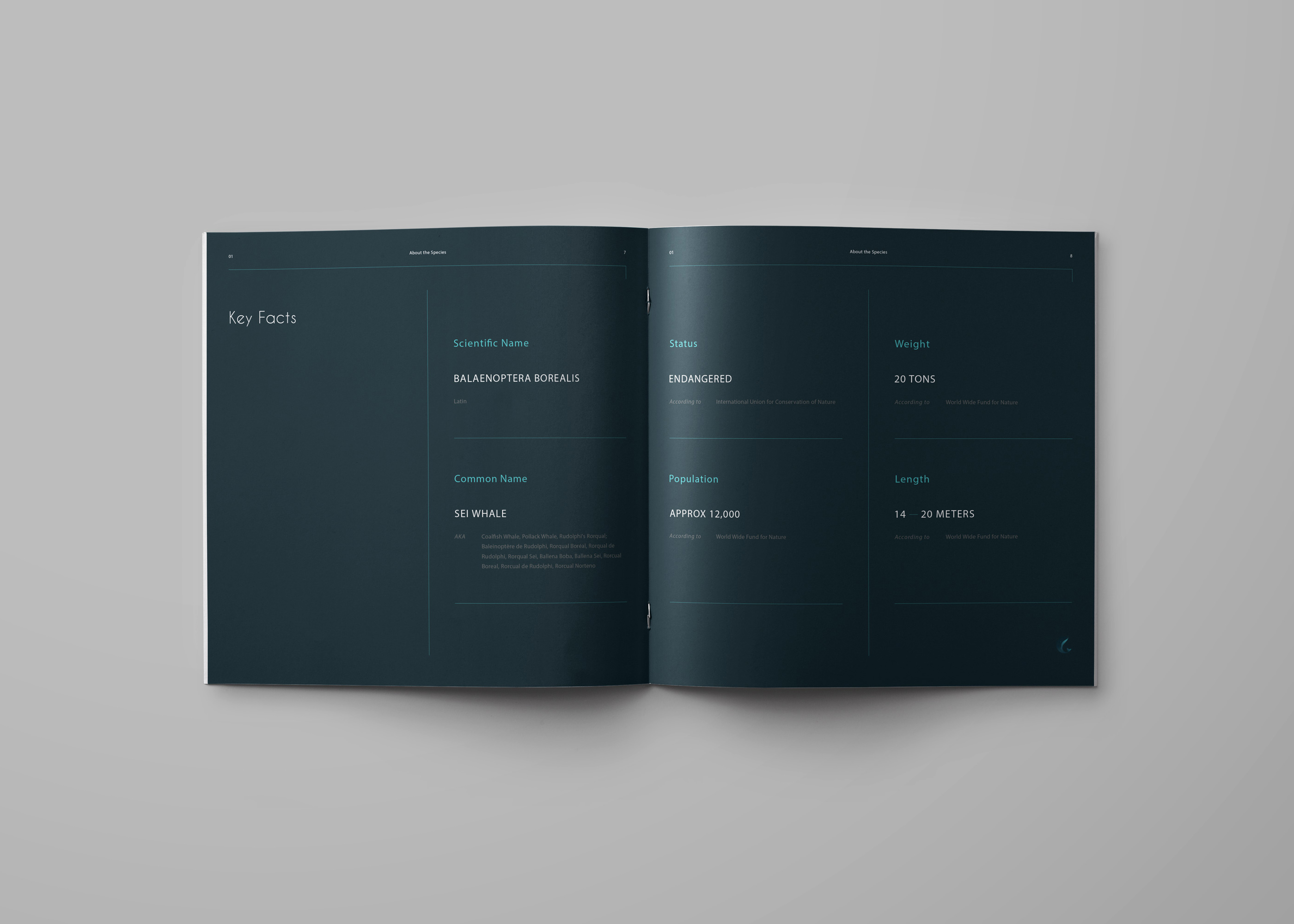
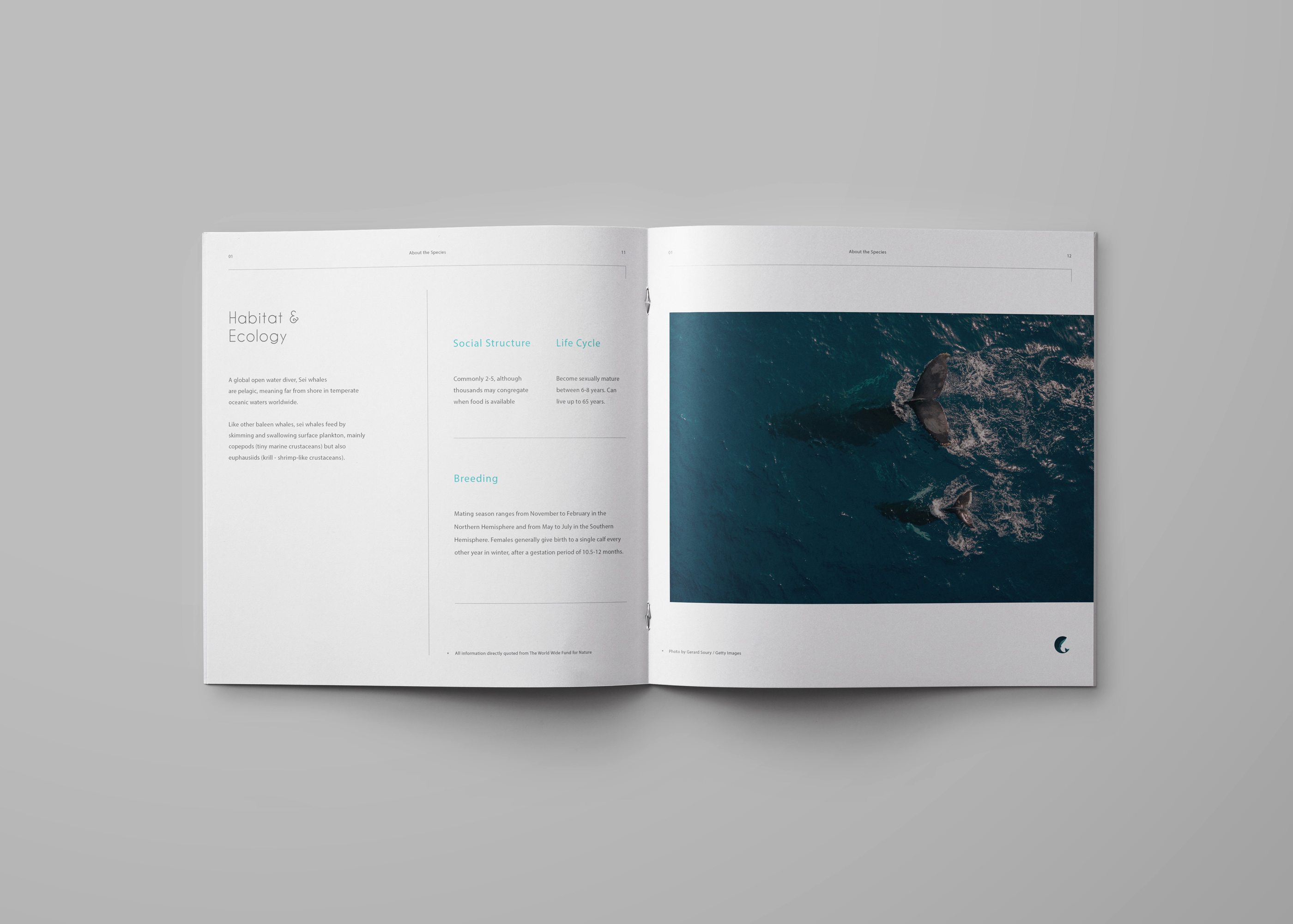
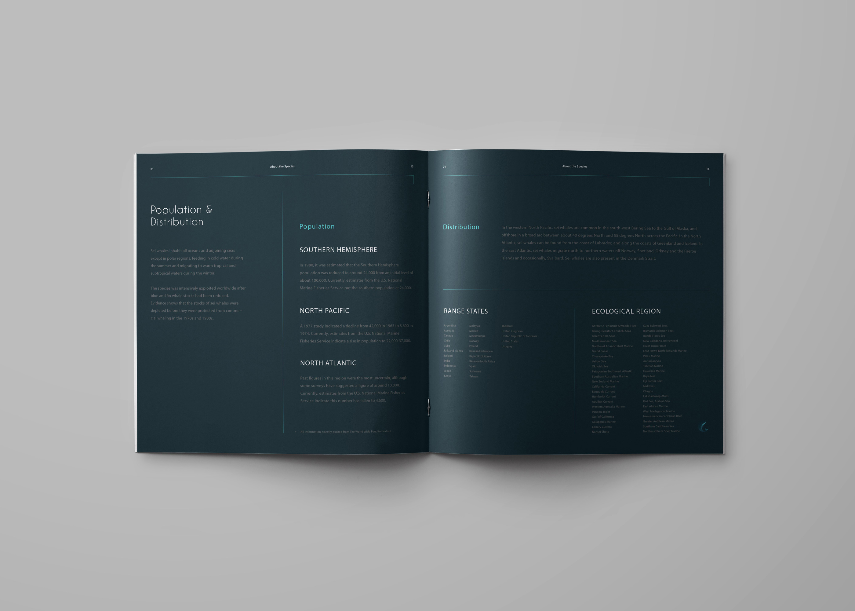
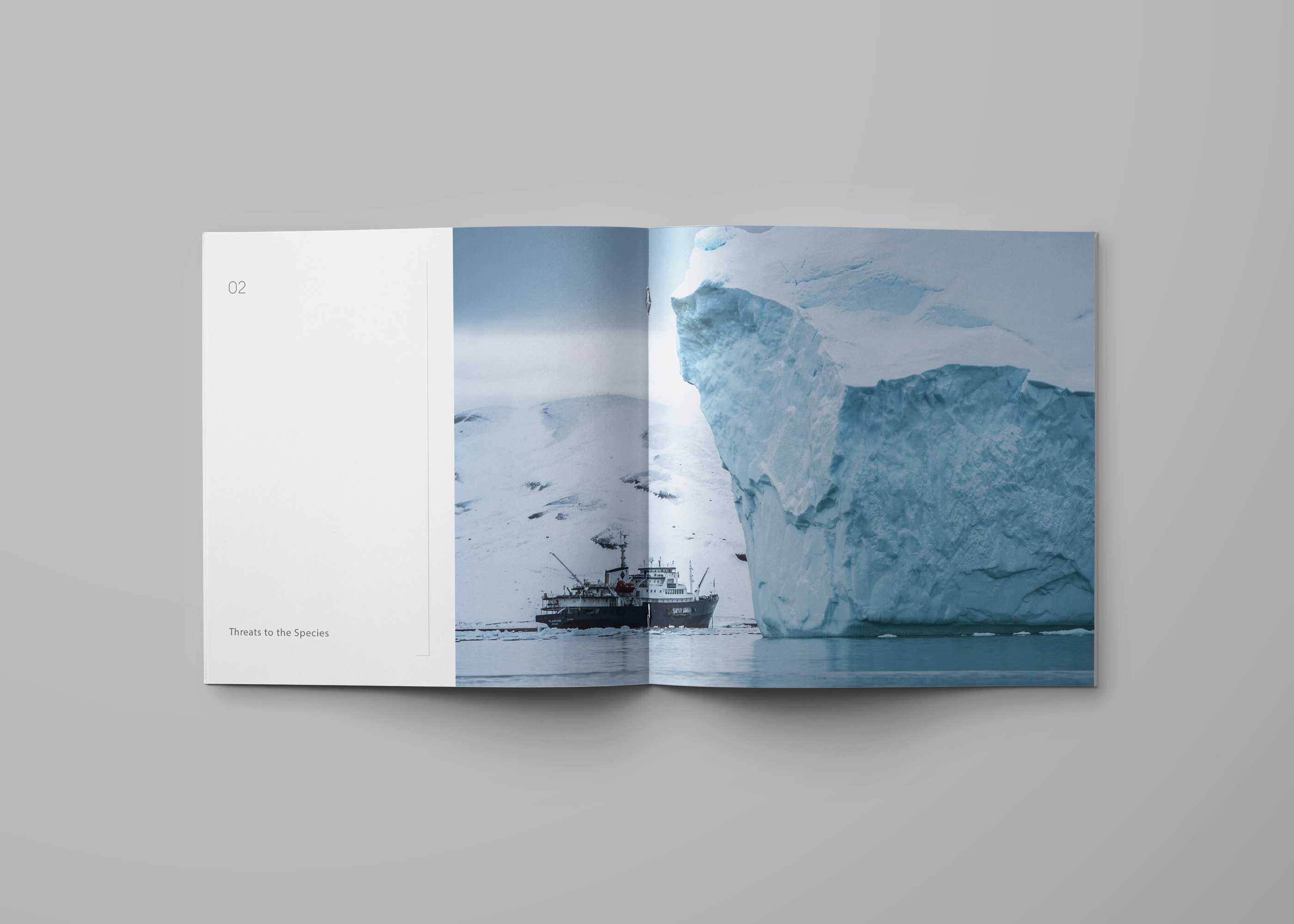
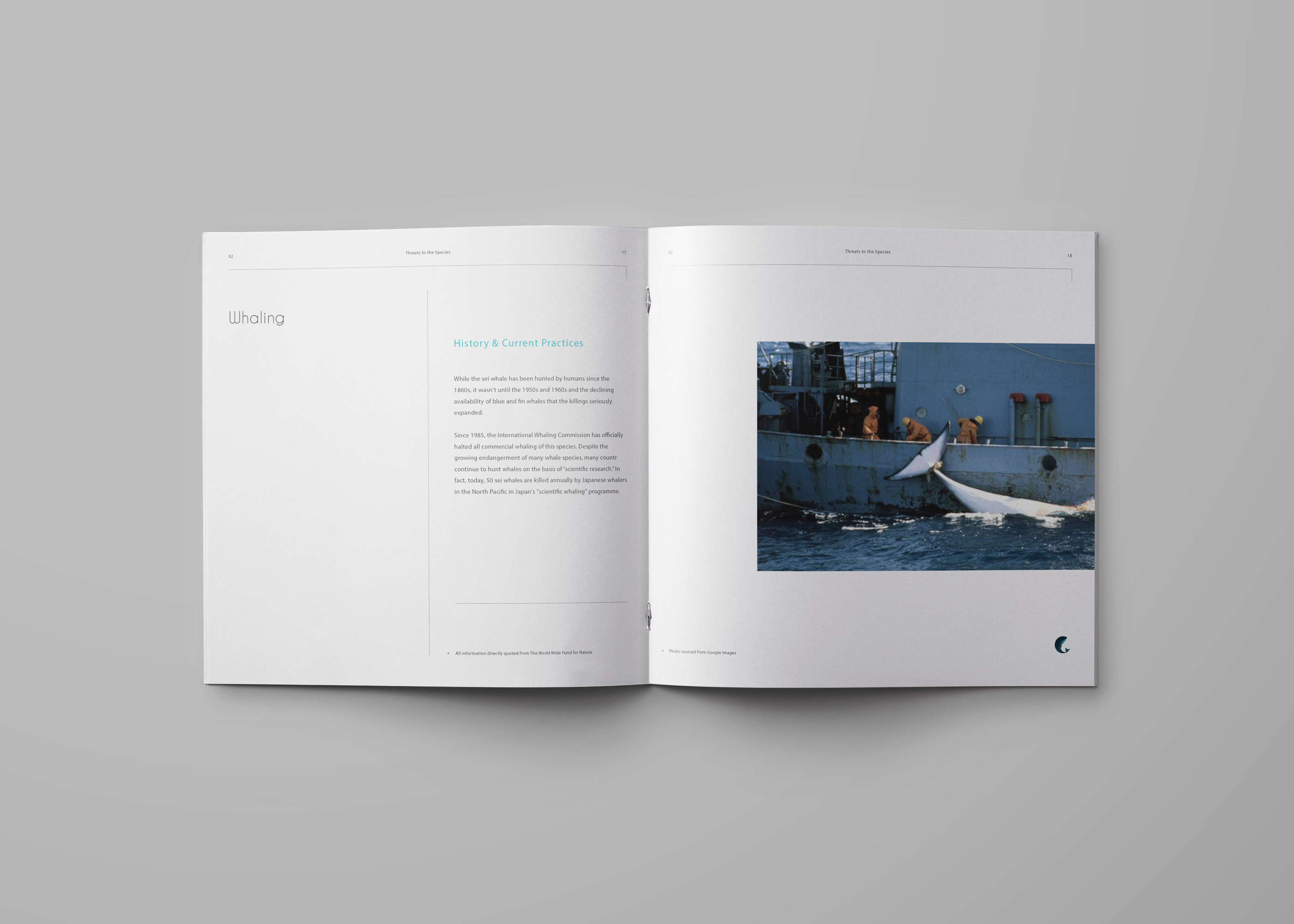
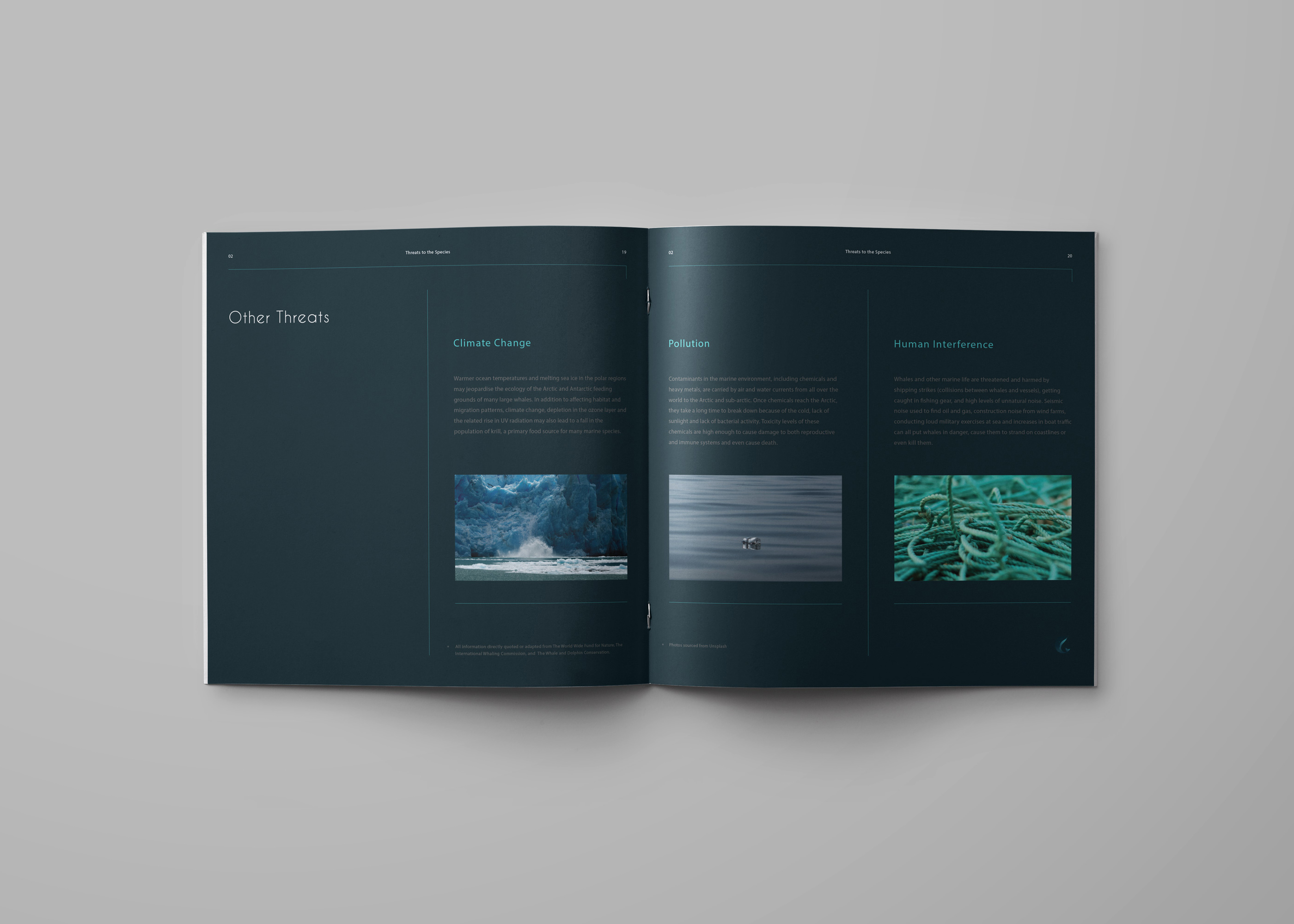
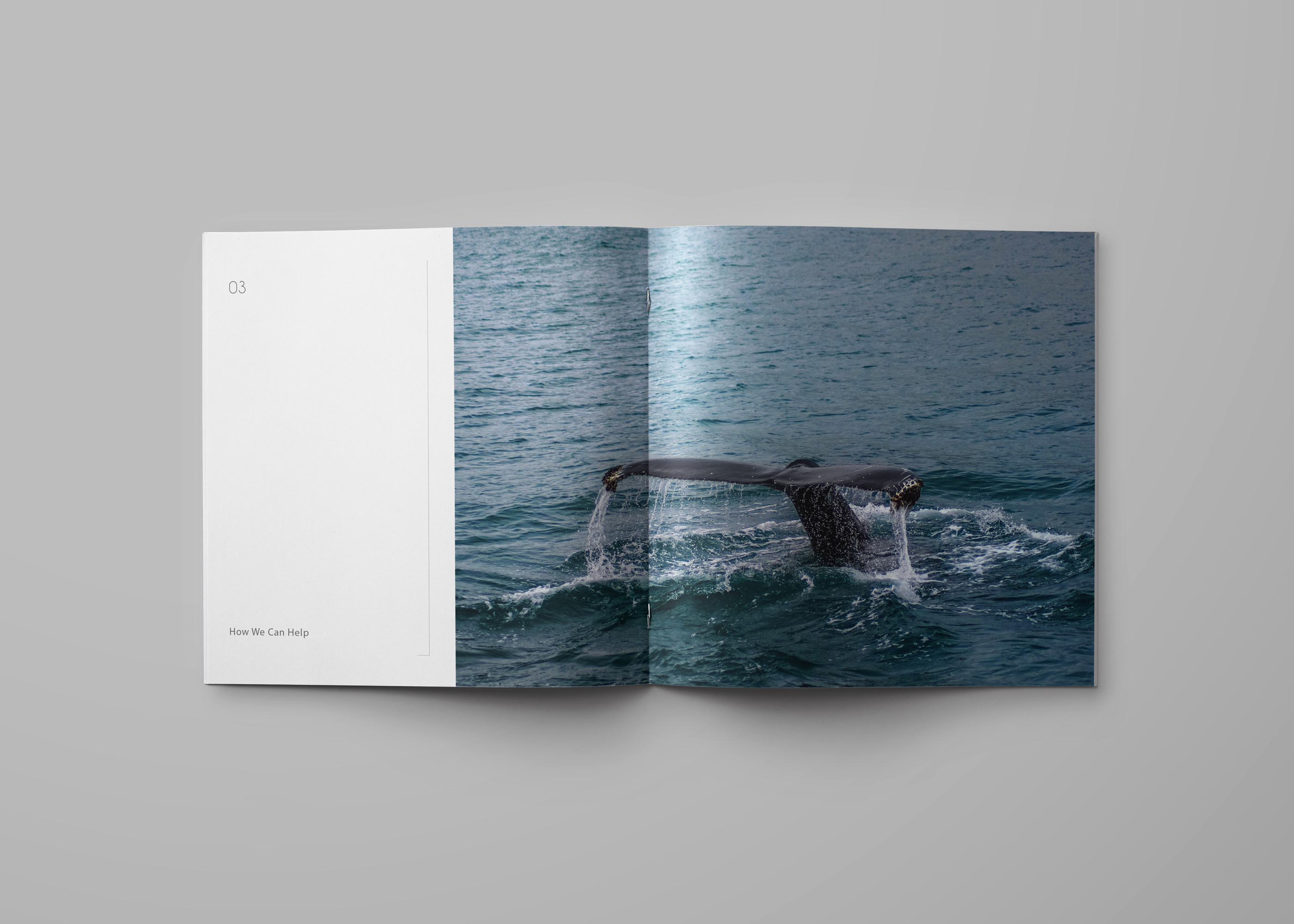
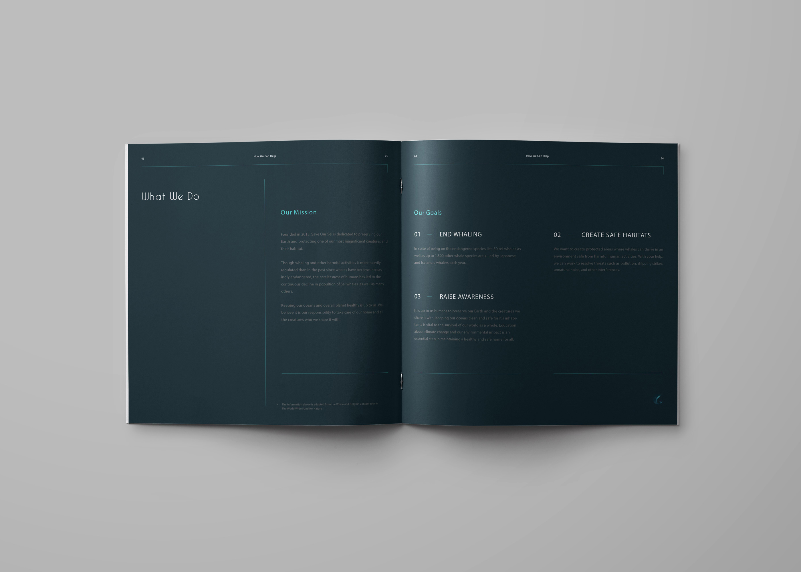
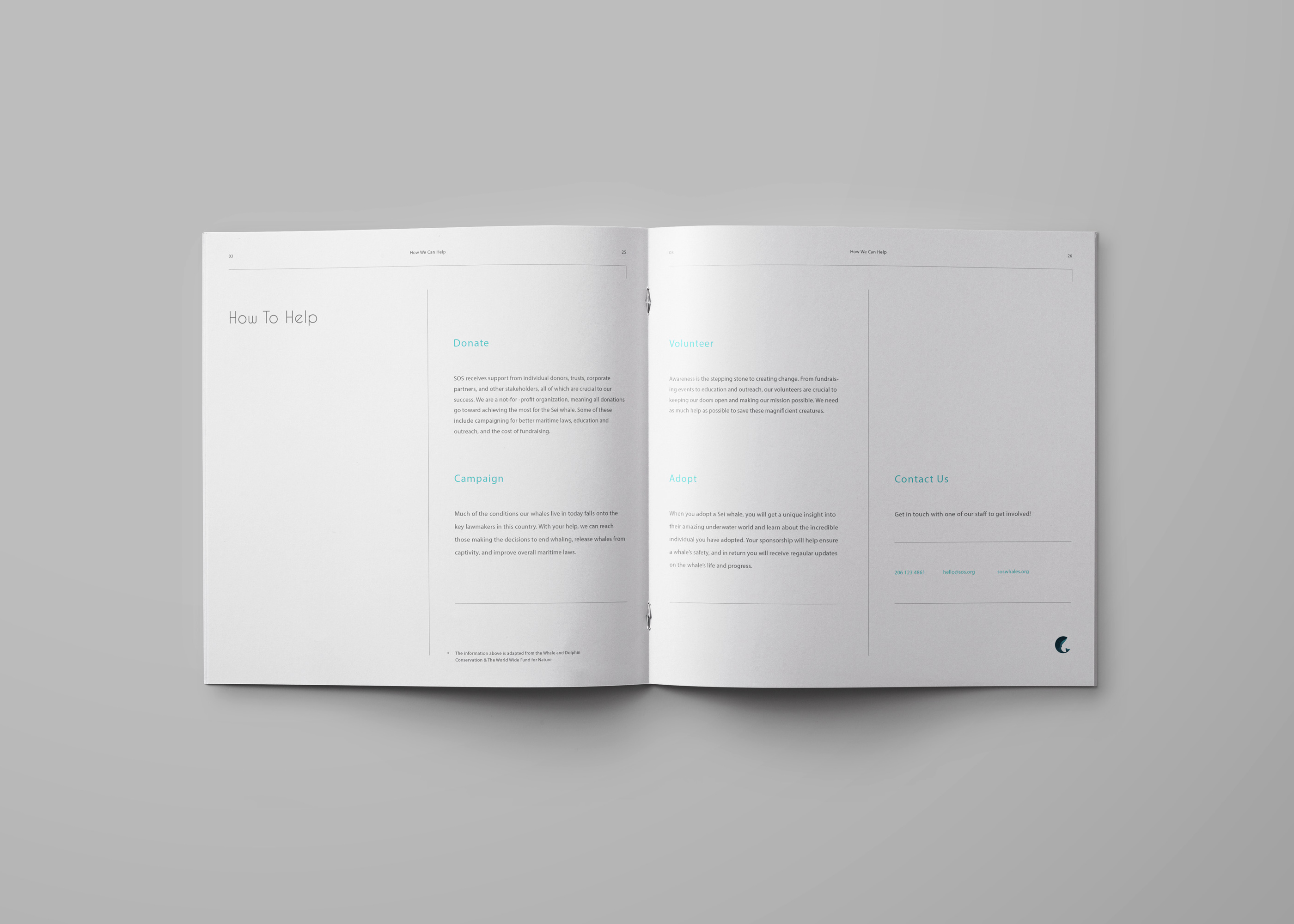
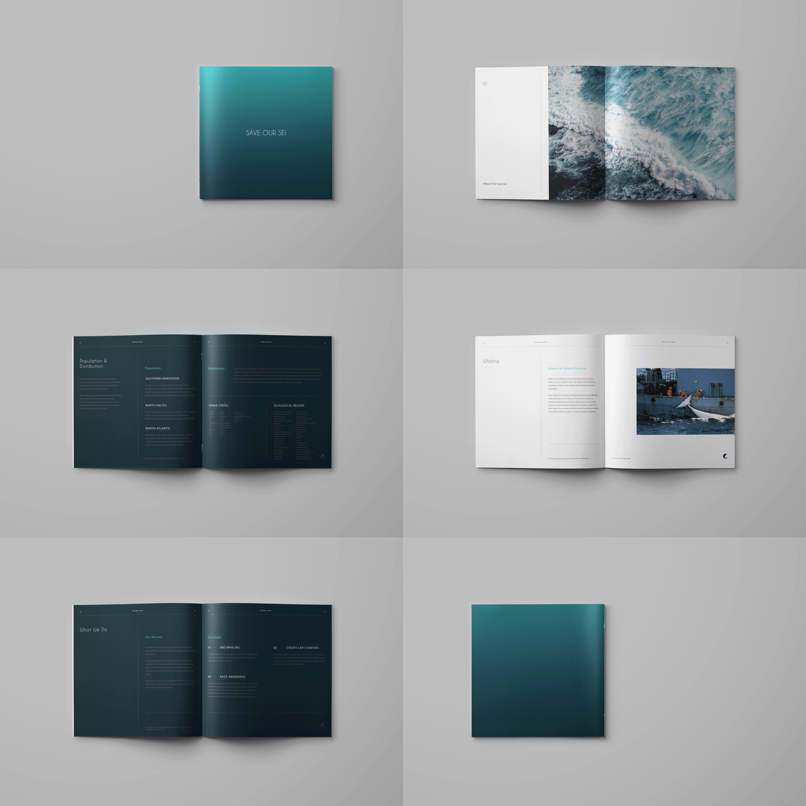
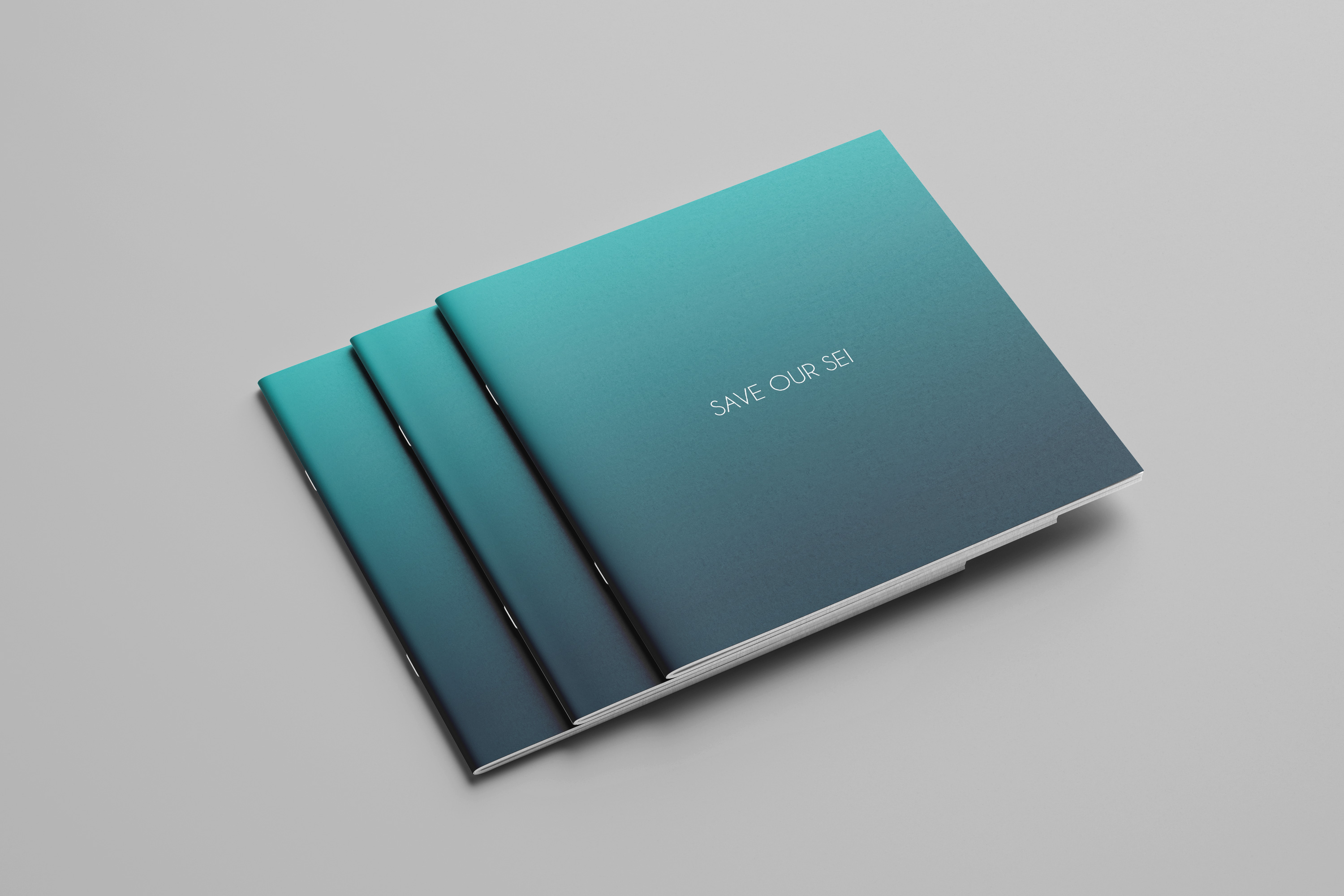
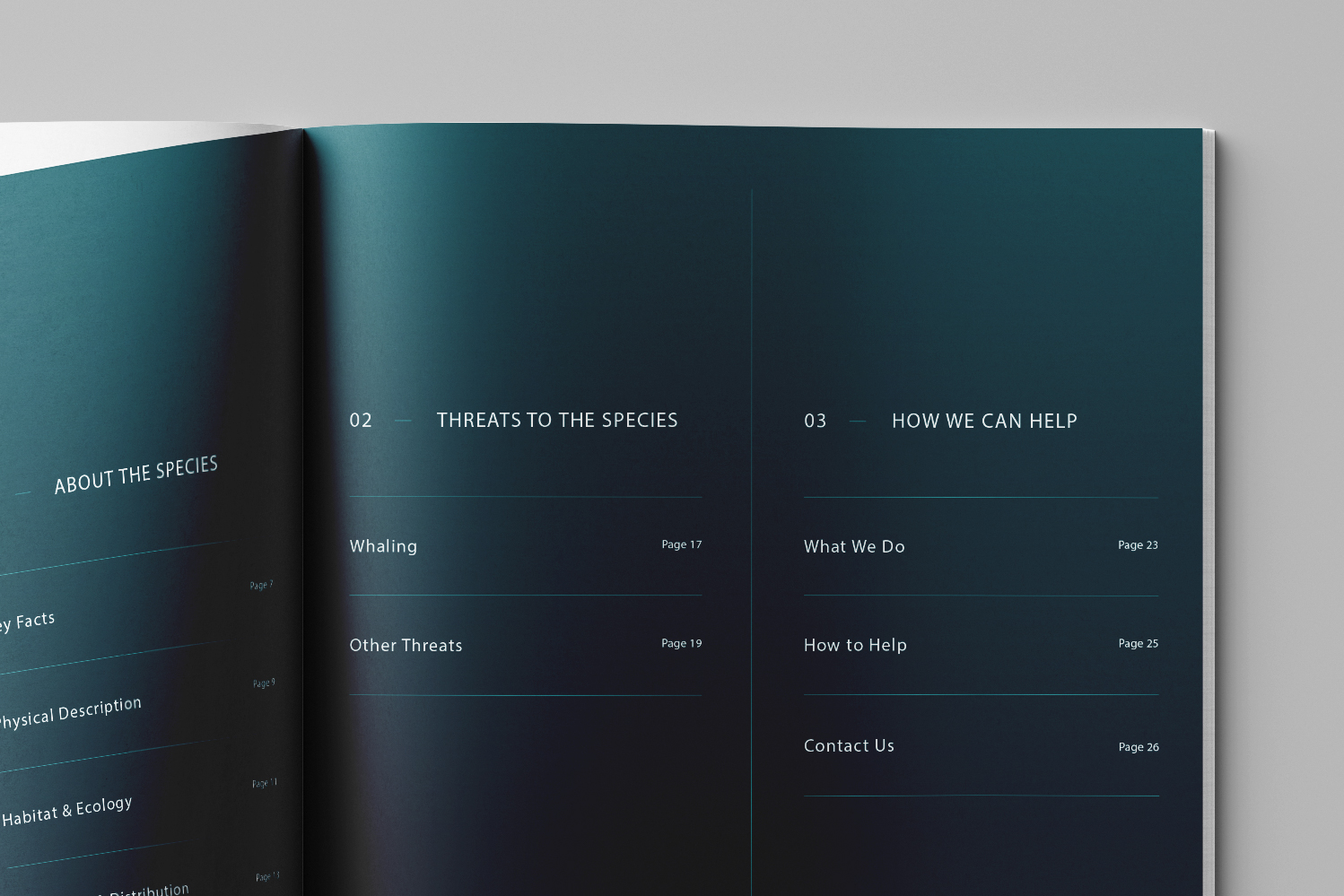
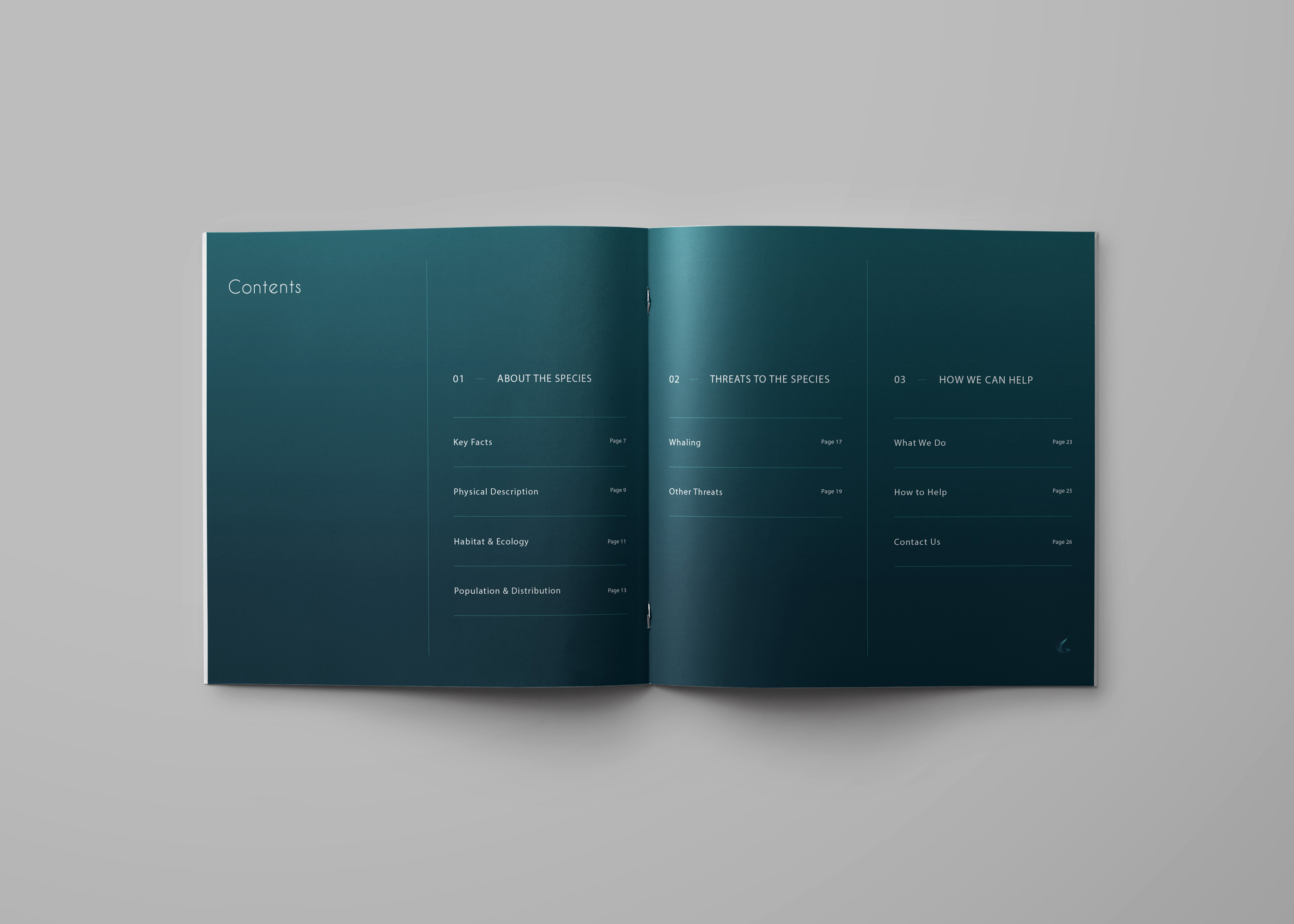
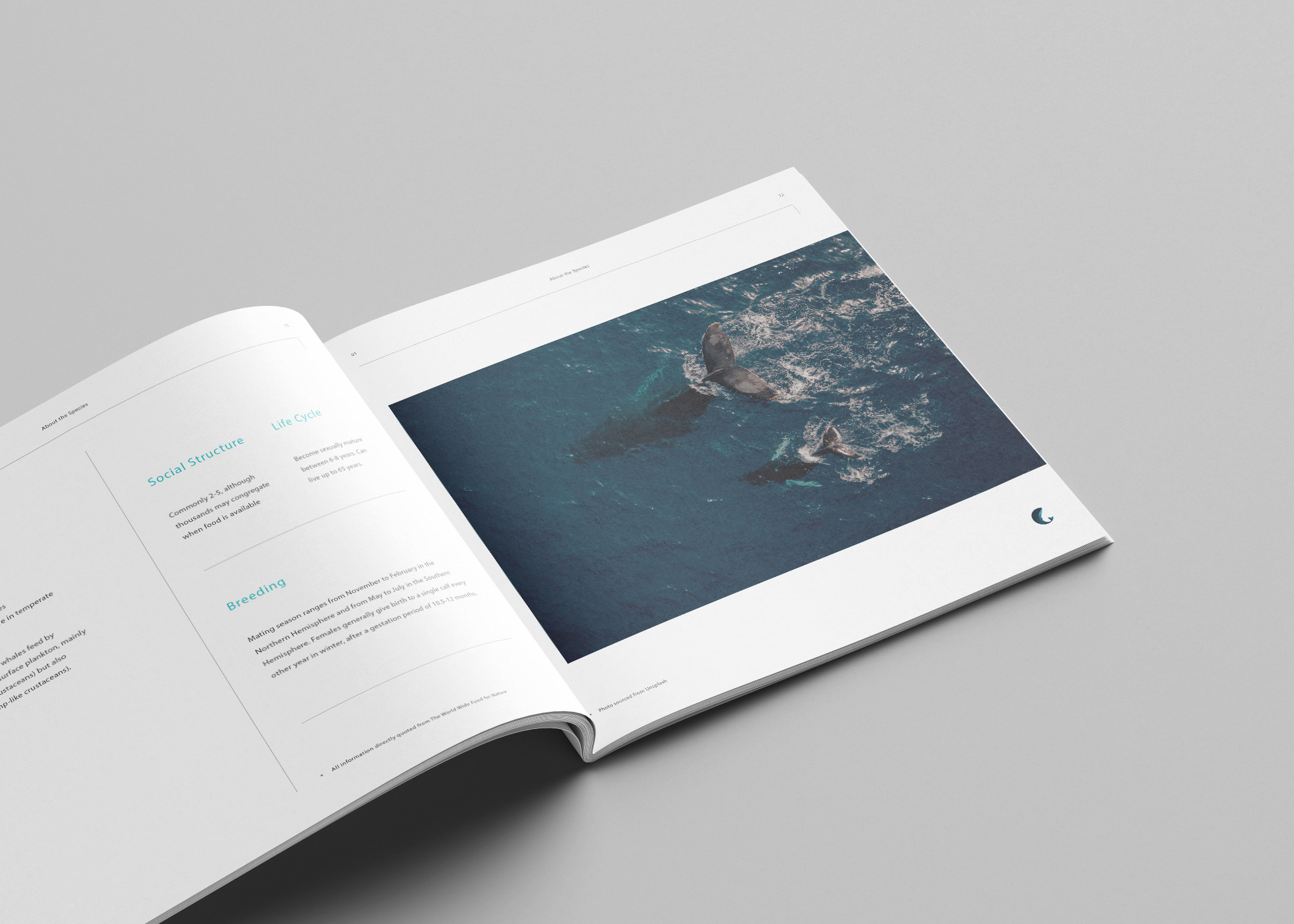
An informational book for patrons and new members was designed using a strict grid system, to organize a lot of information in a way that is visually pleasing with the ultimate goal of raising as much awareness about the animal as possible. All information in the book is cited from The Worldwide Fund for Nature and the Whale and Dolphin Conservation.
Tasks
Brand Identity, Printed Materials

Get in touch
Follow
Copyright Sara L. Walker
Save Our Sei
Save Our Sei is a fictional non-profit organization that I created for a college assignment, which required forming a mission statement and visual identity for an organization in support of the endangered species of our choosing. I was attracted to the powerful yet tranquil nature of the Sei Whale and wanted to design a brand identity with those attributes in mind throughout.
The circle was important to the process of this project, not only to create a neat final logo that fits well into a variety of spaces, but also to echo the fluid movement and shape of the whale and the Earth. Nautical yet minimalistic Cavier Dreams was chosen for the logotype, and is also used for titles in the info book and other printed materials.
The ocean’s depth inspires a gradient palette of blues used for the logo and throughout the brand, accompanied by minimalist grey and white.
An informational book for patrons and new members was designed using a strict grid system, to organize a lot of information in a way that is visually pleasing with the ultimate goal of raising as much awareness about the animal as possible. All information in the book is cited from The Worldwide Fund for Nature and the Whale and Dolphin Conservation.
Tasks
Brand Identity, Printed Materials
Get in touch
Copyright Sara L. Walker.


