Sara L. Walker Portfolio | N.A. Martin
17731
wp-singular,portfolio_page-template-default,single,single-portfolio_page,postid-17731,wp-theme-bridge,qode-quick-links-1.0,,qode-page-loading-effect-enabled, vertical_menu_transparency vertical_menu_transparency_on,qode-title-hidden,qode_grid_1300,side_menu_slide_from_right,qode-theme-ver-17.1,qode-theme-bridge,disabled_footer_top,disabled_footer_bottom,wpb-js-composer js-comp-ver-7.9,vc_responsive
Project Details
N.A. Martin is a fashion design studio and shop located in Northwest Arkansas. Since 2012, owner and designer Nancy Martin has created a line of high quality, classic garments for every body, led by her signature slim-lined, everyday skirt. A longtime fashion devotee turned designer, Nancy wants to challenge the notion that style and comfort can’t go hand in hand.
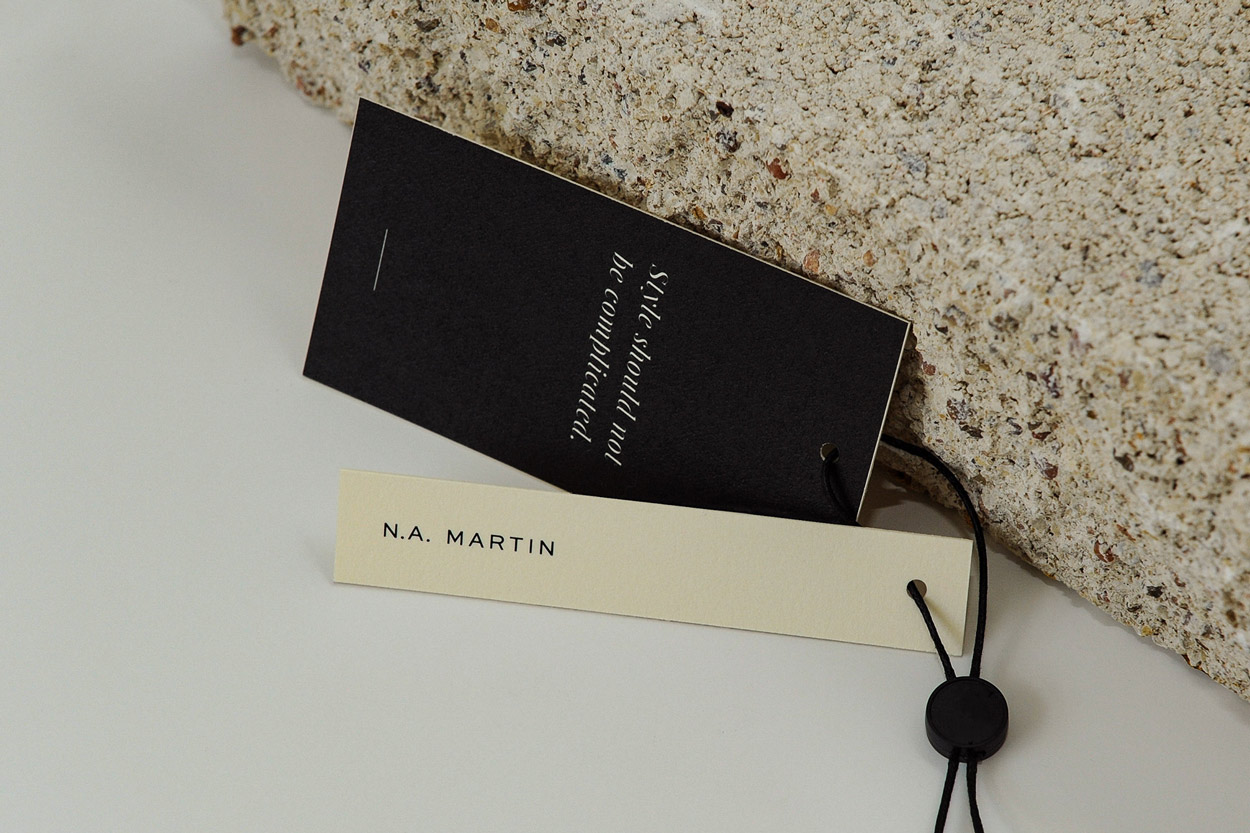
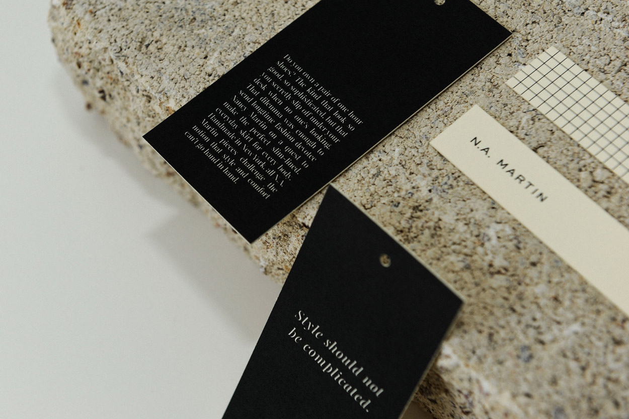
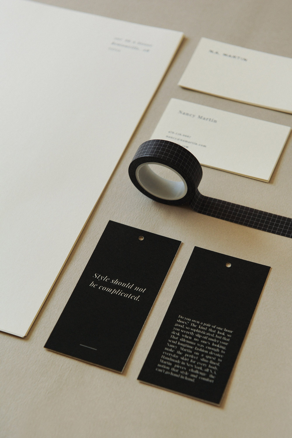
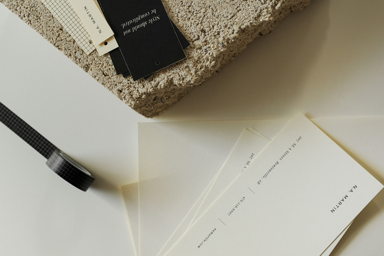
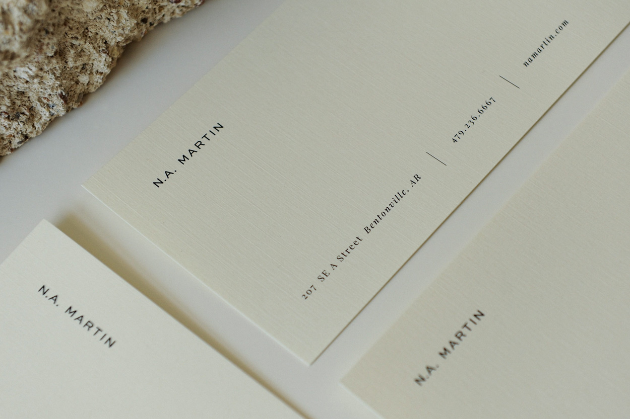
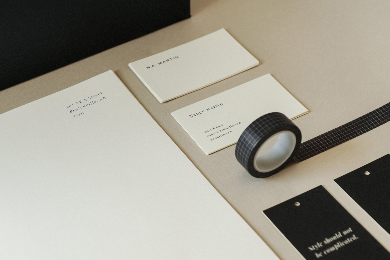
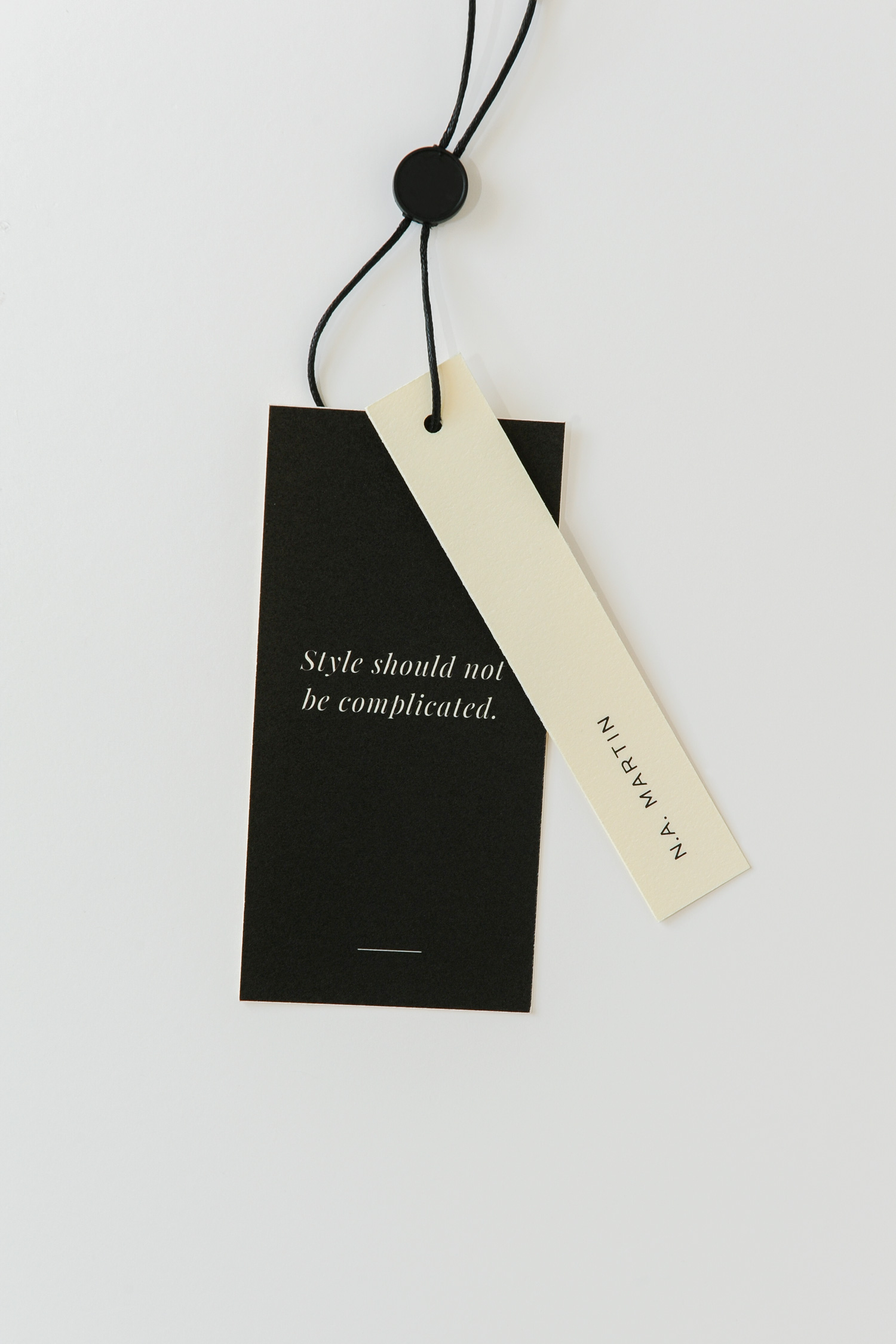
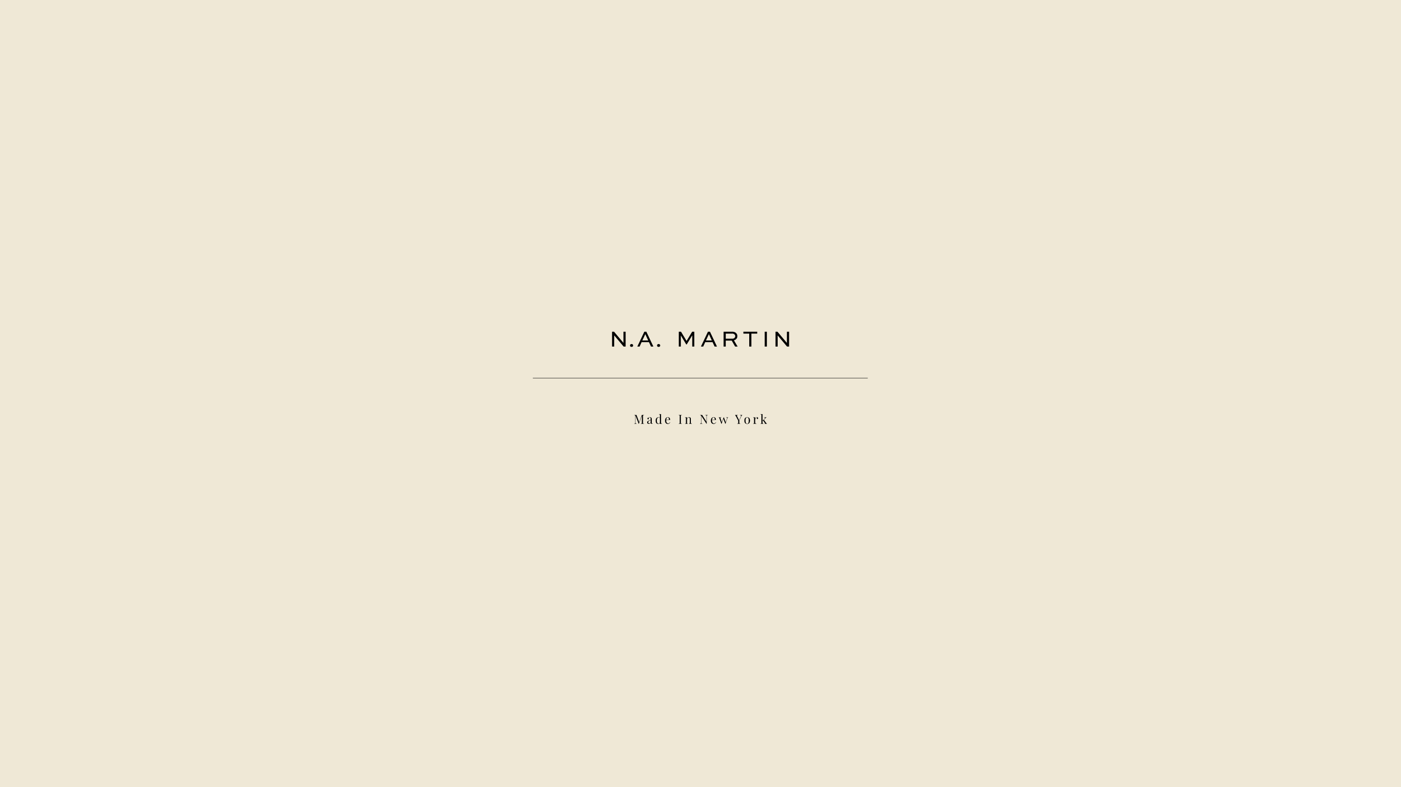
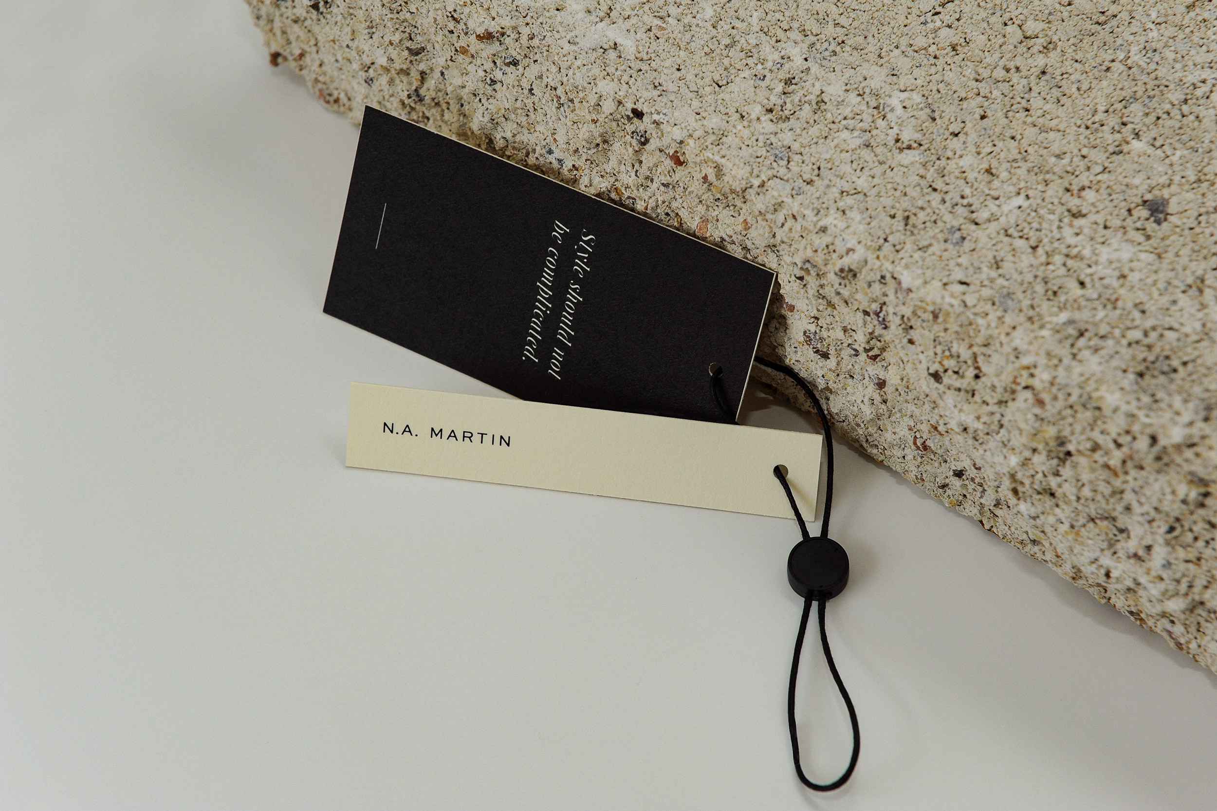
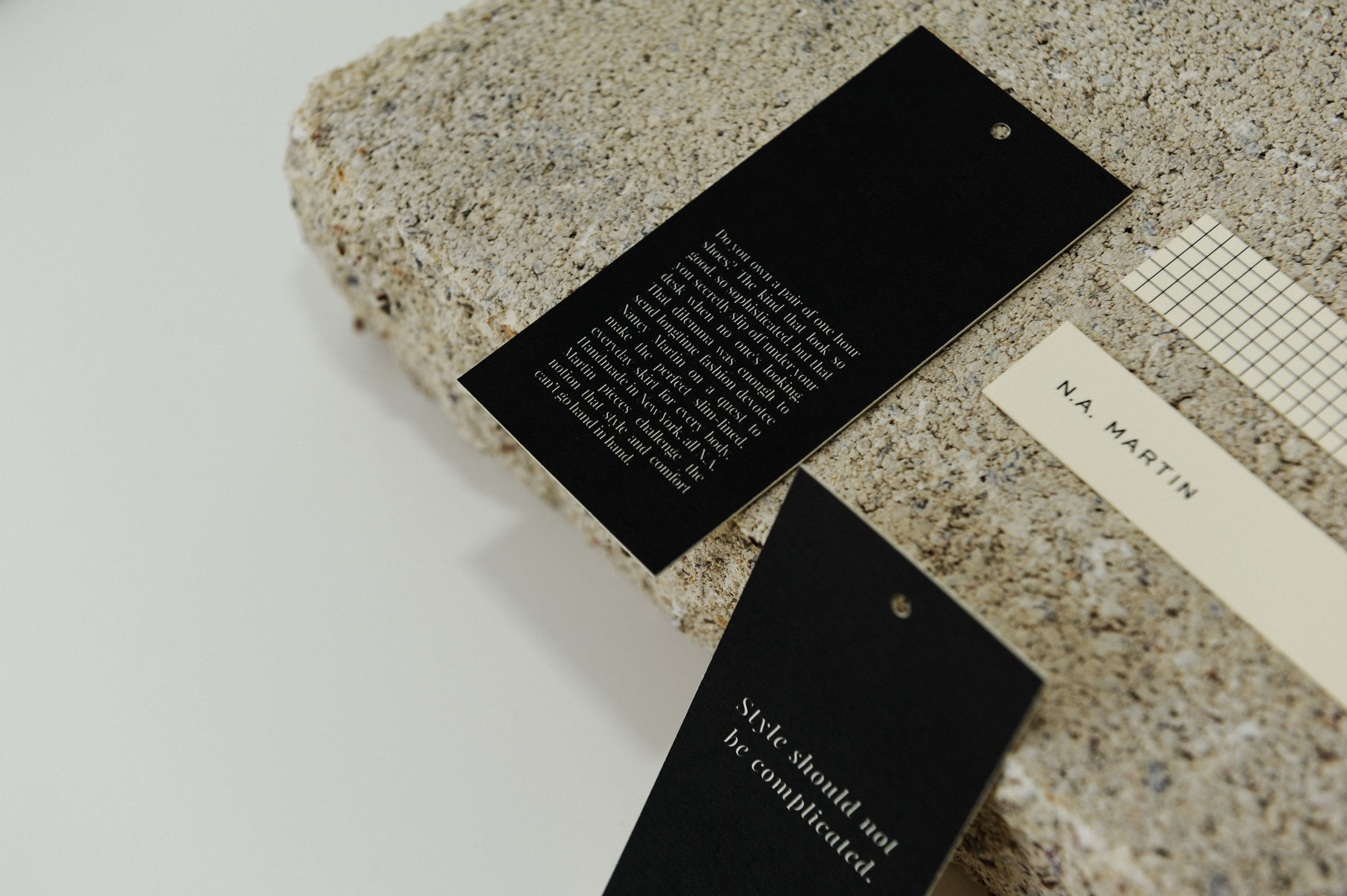
I was tasked with giving N.A. Martin a brand refresh to compliment her high end products and create more brand recognition for her desired customer. At N.A. Martin’s core is the concept that “Style should not be complicated”, so it was important to approach every piece of her new visual identity through this lens. We refined the existing primary logo with updated typography and treatment, staying true to a classic look and feel.
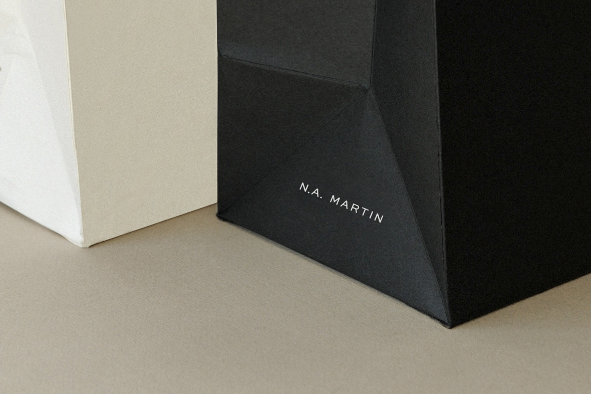
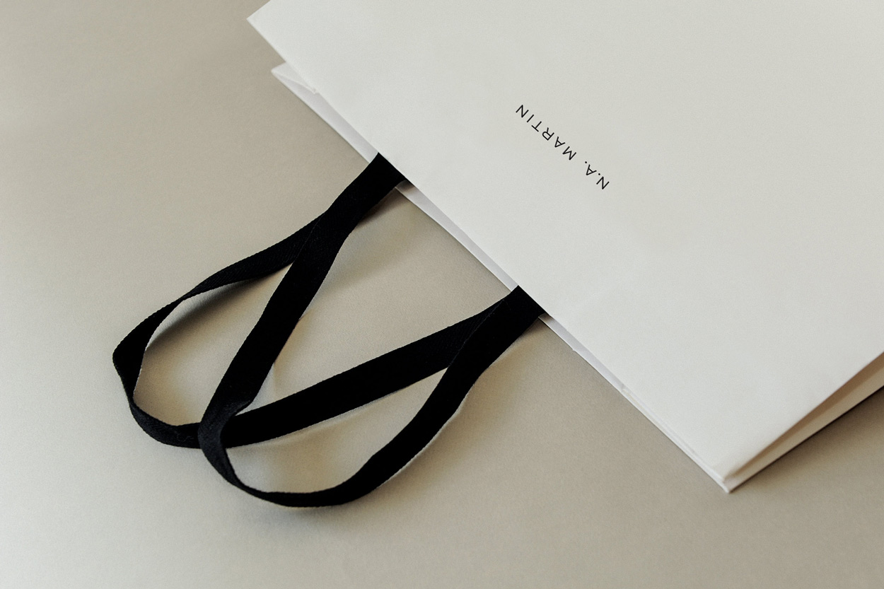
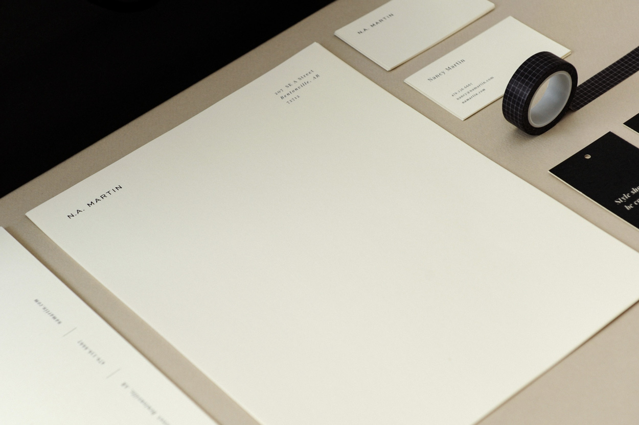
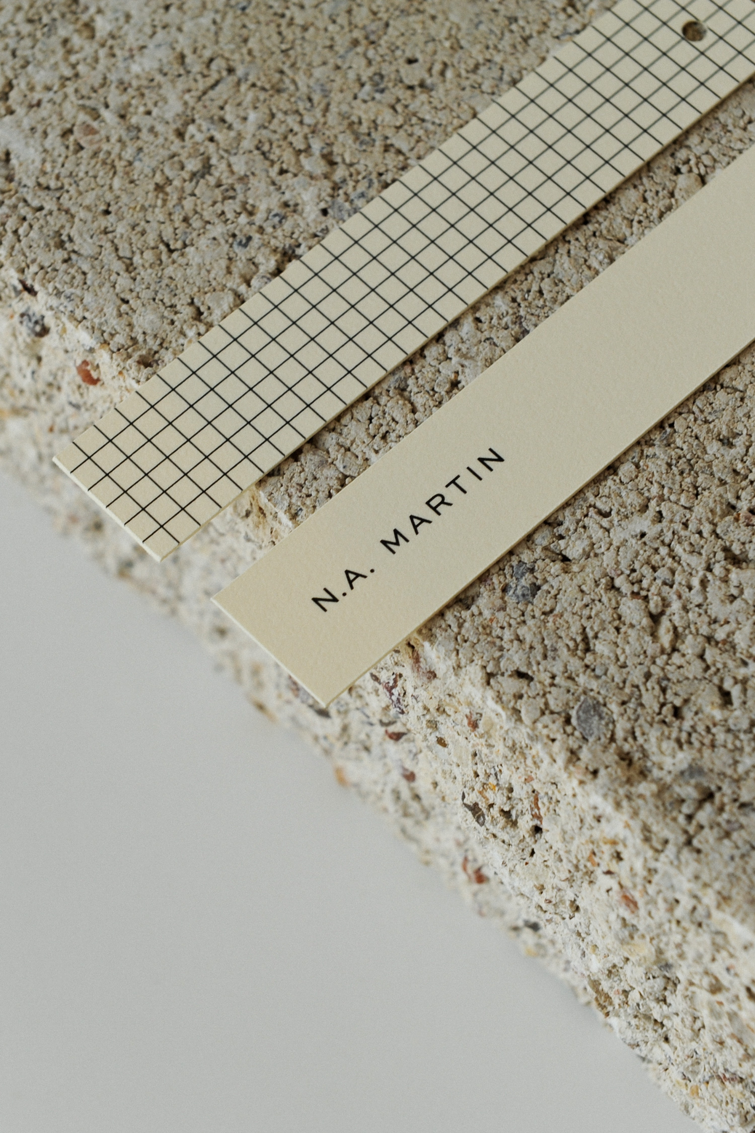
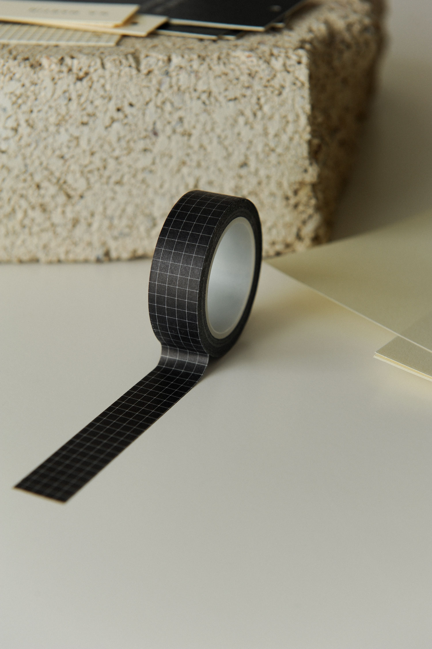
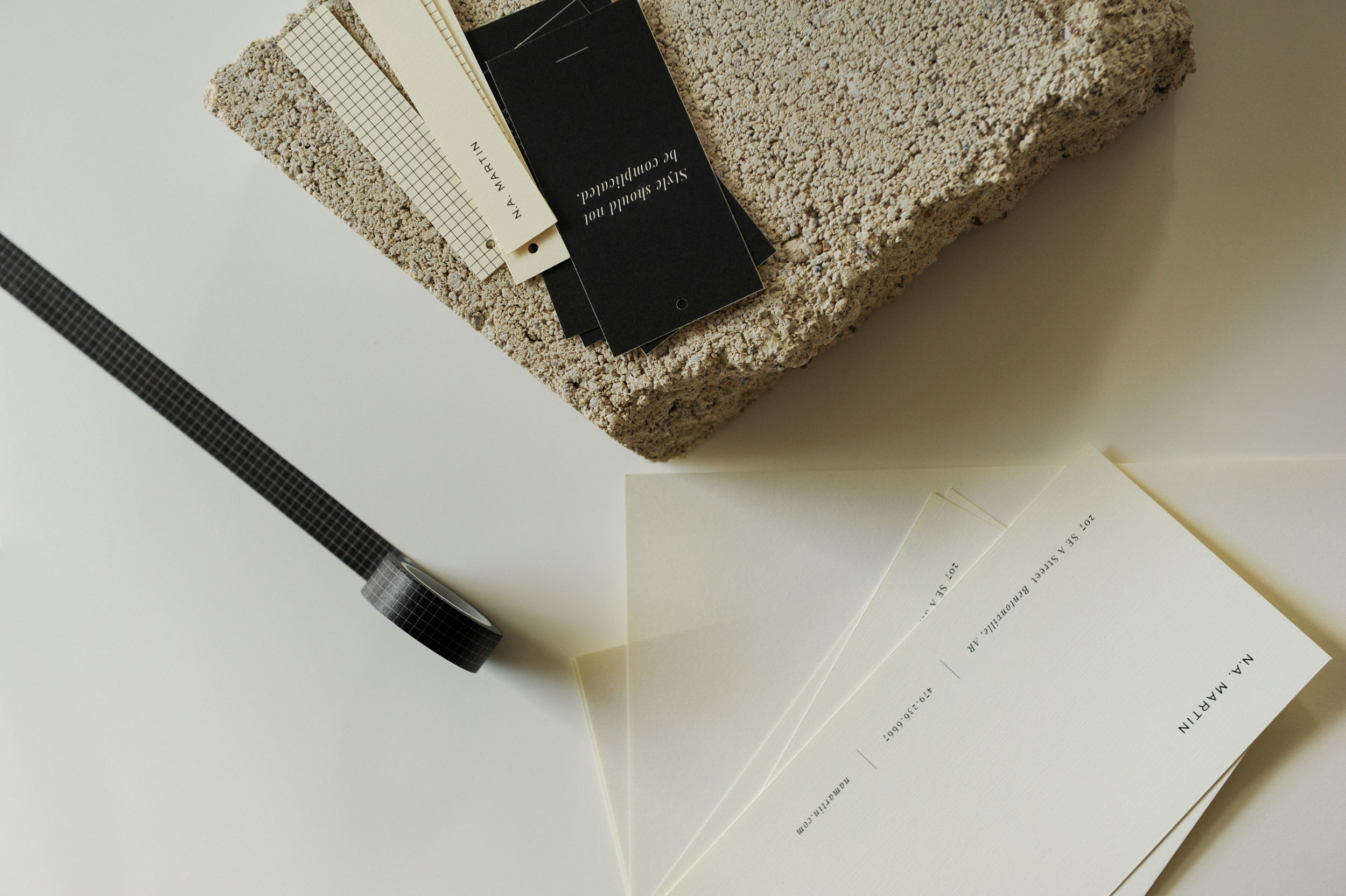
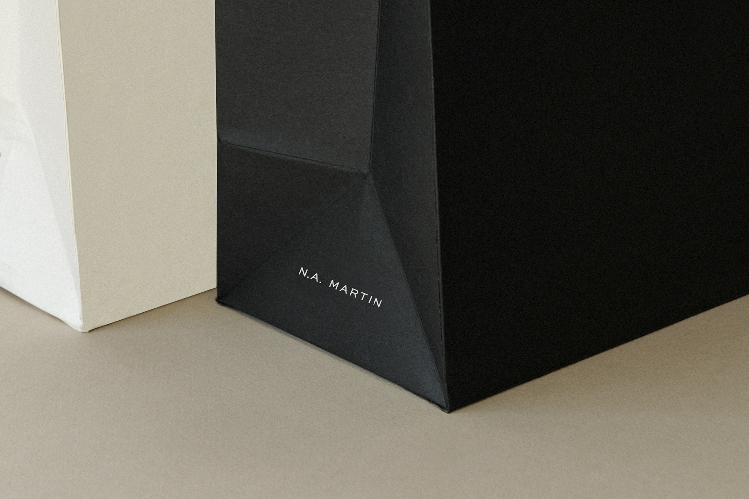
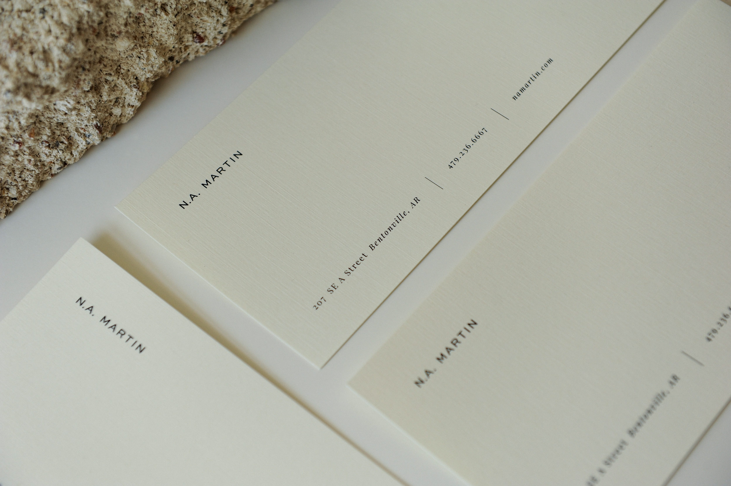
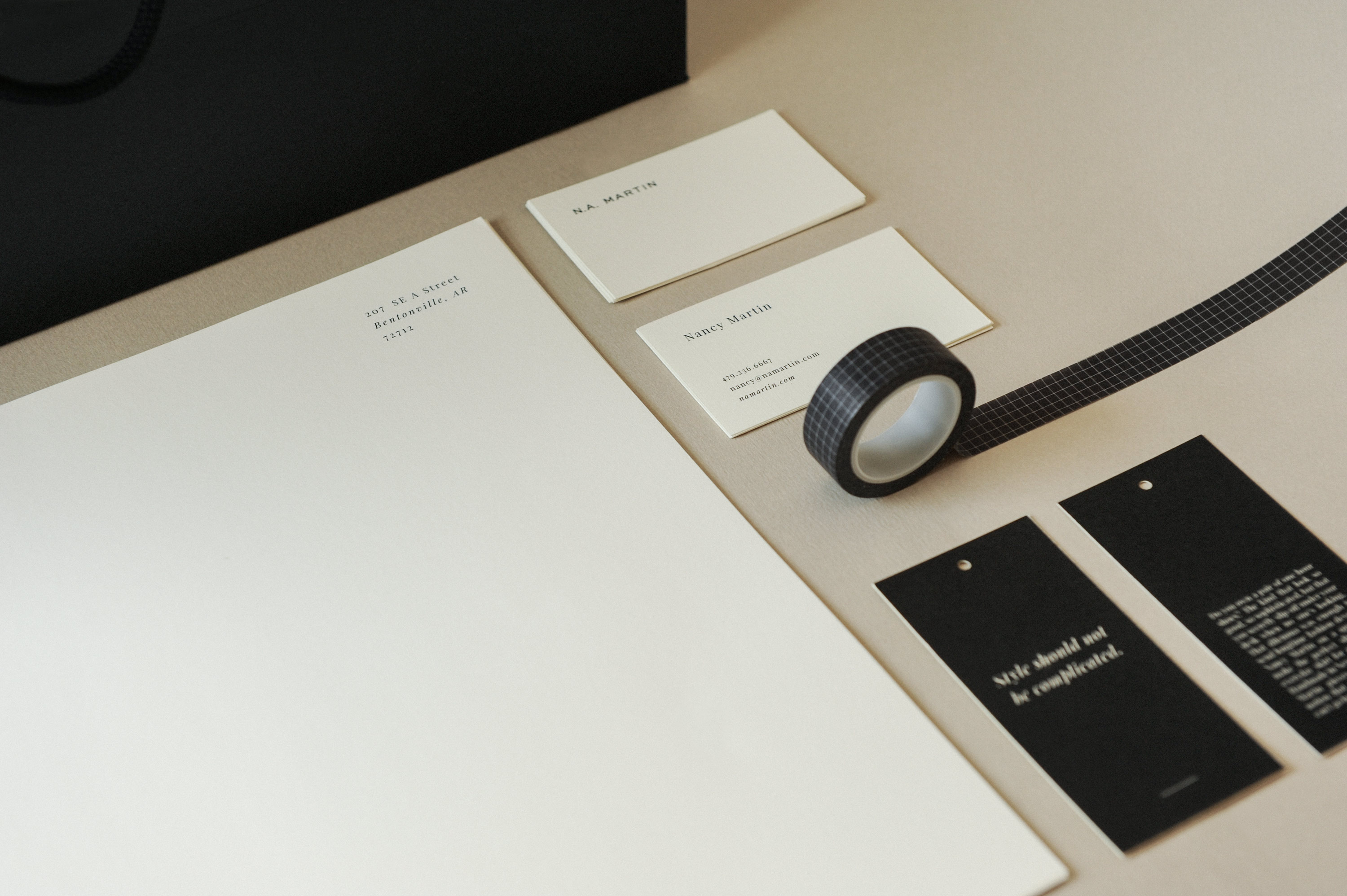
This aesthetic is carried through the brand, using a netural color palette of black and cream, minimalist grid pattern inspired by the process of making a garment, and thick, textured cardstock and packaging materials to create a premium feel.
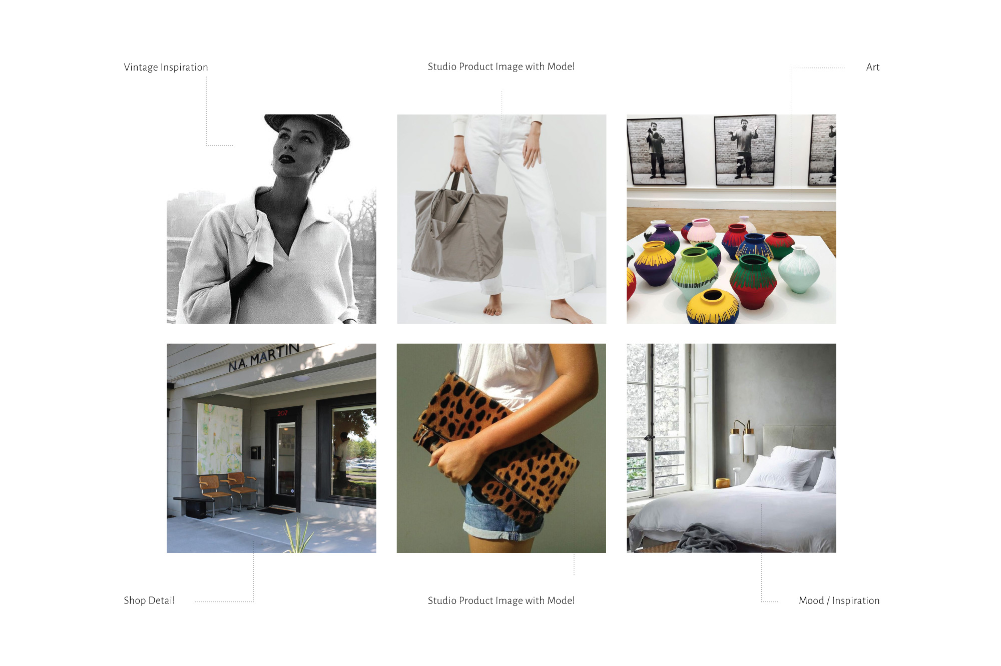
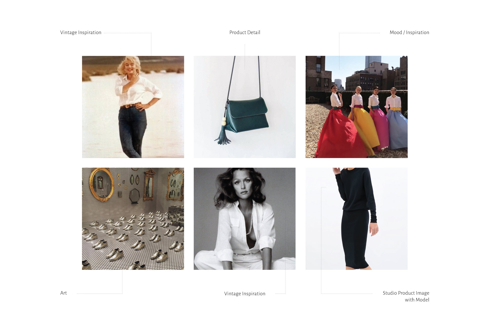
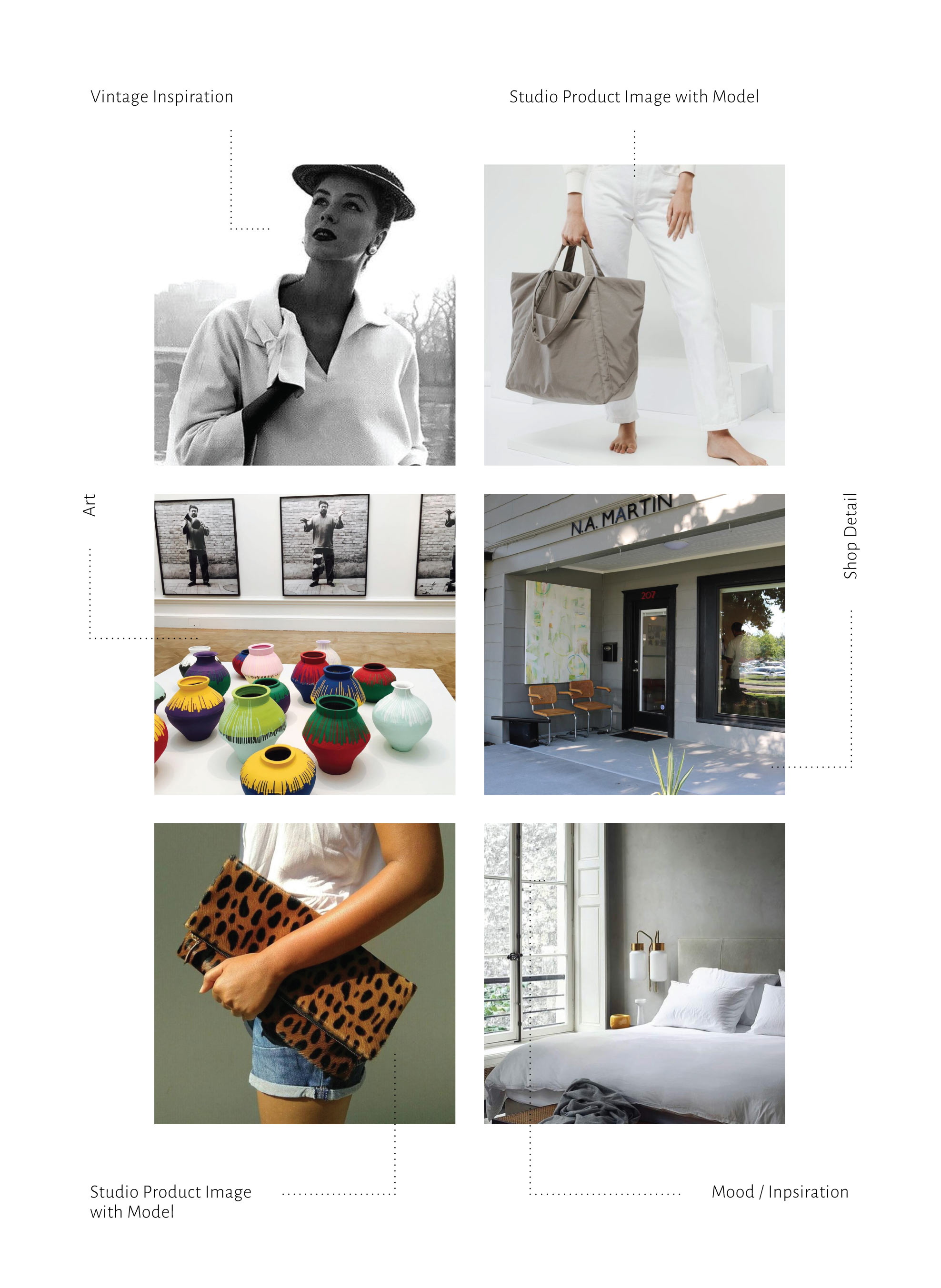
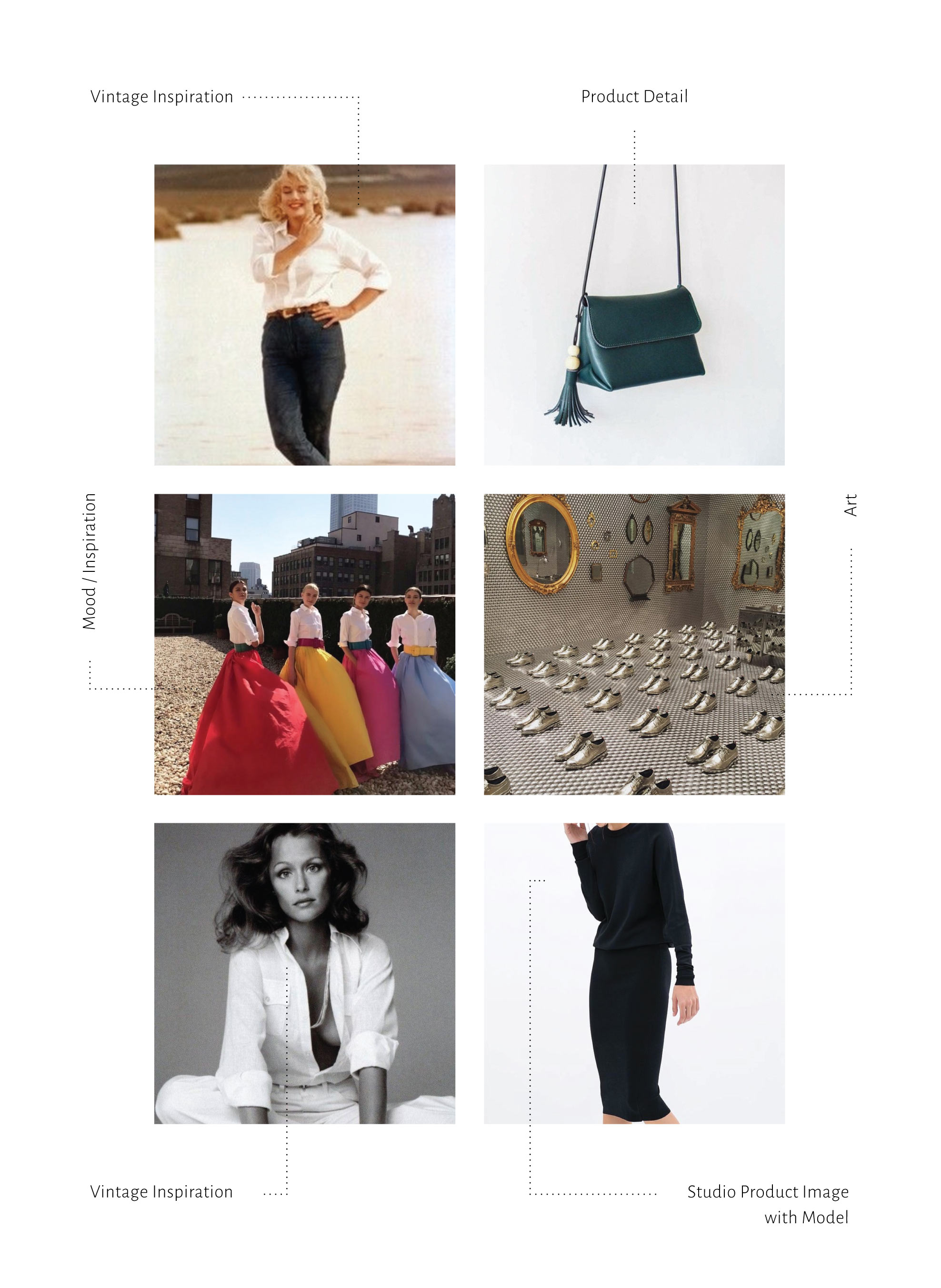
Social guidelines were created for the brand’s presence on Instagram by reviewing her current content and pairing down to five recommended categories, defining a framework that aligns with the brand’s voice and messaging.
Tasks
Brand Identity, Printed Materials, Packaging, Strategy
Credits
Agency : Archetype Productions
Product Photo : Elkins Design


Style should not be complicated.


Social Guidelines


Get in touch
Follow
Copyright Sara L. Walker
N.A. Martin
N.A. Martin is a fashion design studio and shop located in Northwest Arkansas. Since 2012, owner and designer Nancy Martin has created a line of high quality, classic garments for every body, led by her signature slim-lined, everyday skirt. A longtime fashion devotee turned designer, Nancy wants to challenge the notion that style and comfort can’t go hand in hand.
I was tasked with giving N.A. Martin a brand refresh to compliment her high end products and create more brand recognition for her desired customer. At N.A. Martin’s core is the concept that “Style should not be complicated”, so it was important to approach every piece of her new visual identity through this lens. We refined the existing primary logo with updated typography and treatment, staying true to a classic look and feel.
This aesthetic is carried through the brand, using a netural color palette of black and cream, minimalist grid pattern inspired by the process of making a garment, and thick, textured cardstock and packaging materials to create a premium feel.
Social guidelines were created for the brand’s presence on Instagram by reviewing her current content and pairing down to five recommended categories, defining a framework that aligns with the brand’s voice and messaging.
Tasks
Brand Identity, Printed Materials, Packaging, Strategy
Credits
Agency : Archetype Productions
Product Photo : Elkins Design


Style should not be complicated.
