Sara L. Walker Portfolio | Liberty Hills Ranch
17588
wp-singular,portfolio_page-template-default,single,single-portfolio_page,postid-17588,wp-theme-bridge,qode-quick-links-1.0,,qode-page-loading-effect-enabled, vertical_menu_transparency vertical_menu_transparency_on,qode-title-hidden,qode_grid_1300,side_menu_slide_from_right,qode-theme-ver-17.1,qode-theme-bridge,disabled_footer_top,disabled_footer_bottom,wpb-js-composer js-comp-ver-7.9,vc_responsive
Project Details
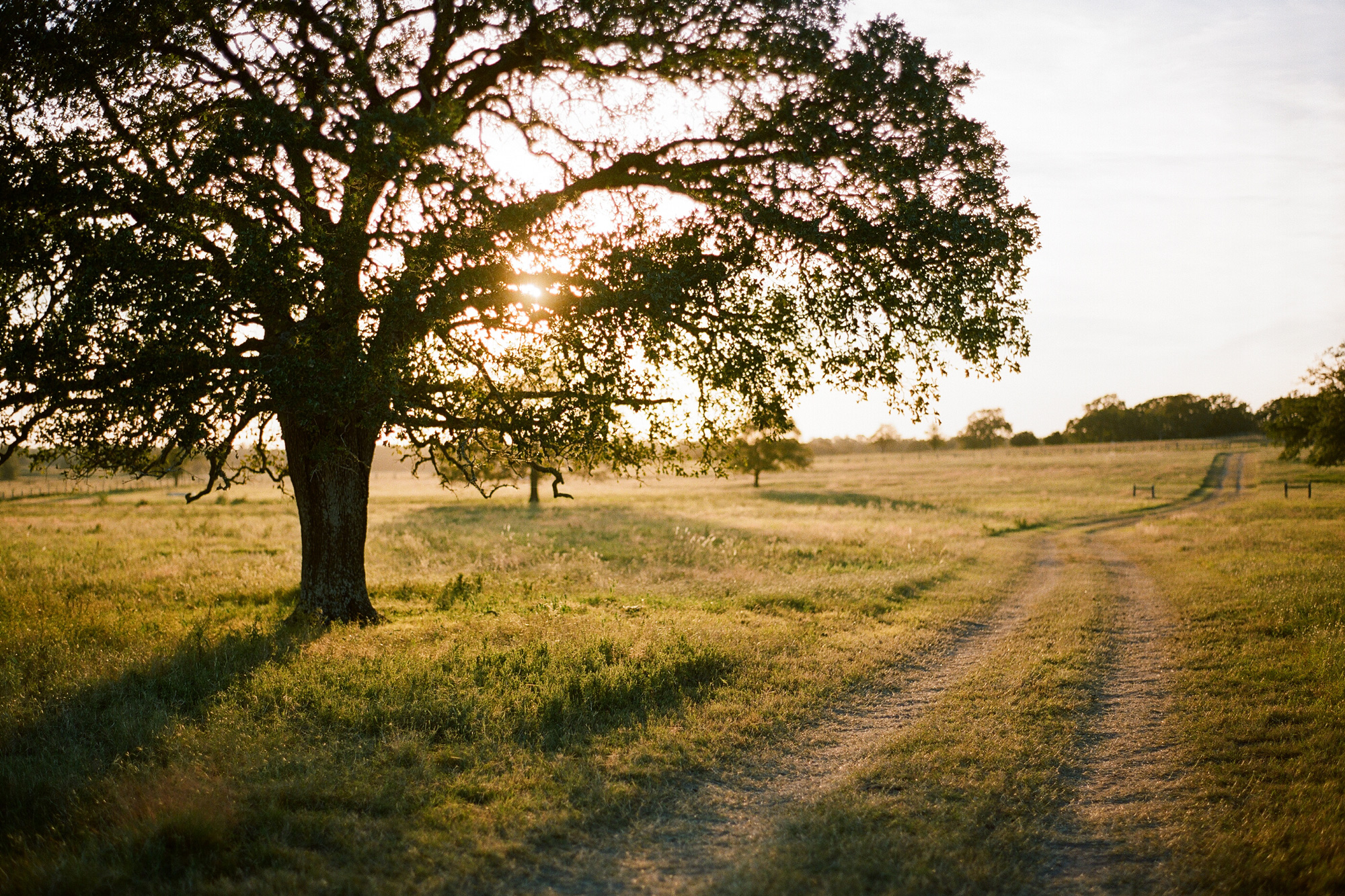
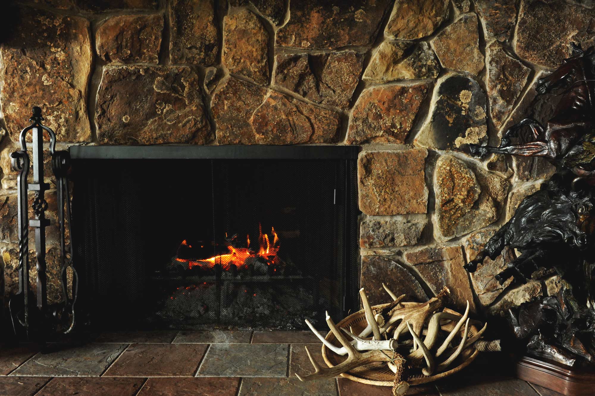
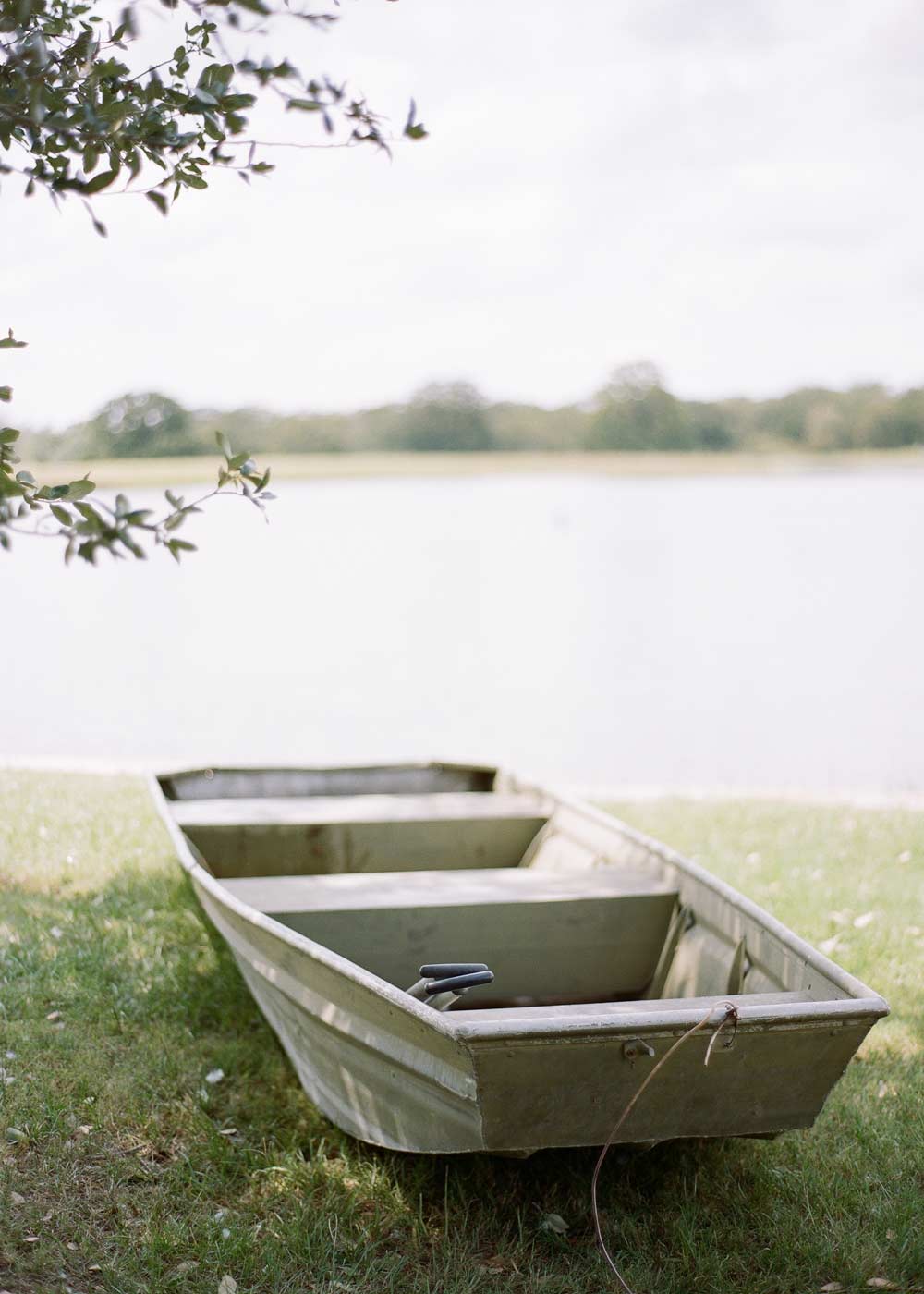
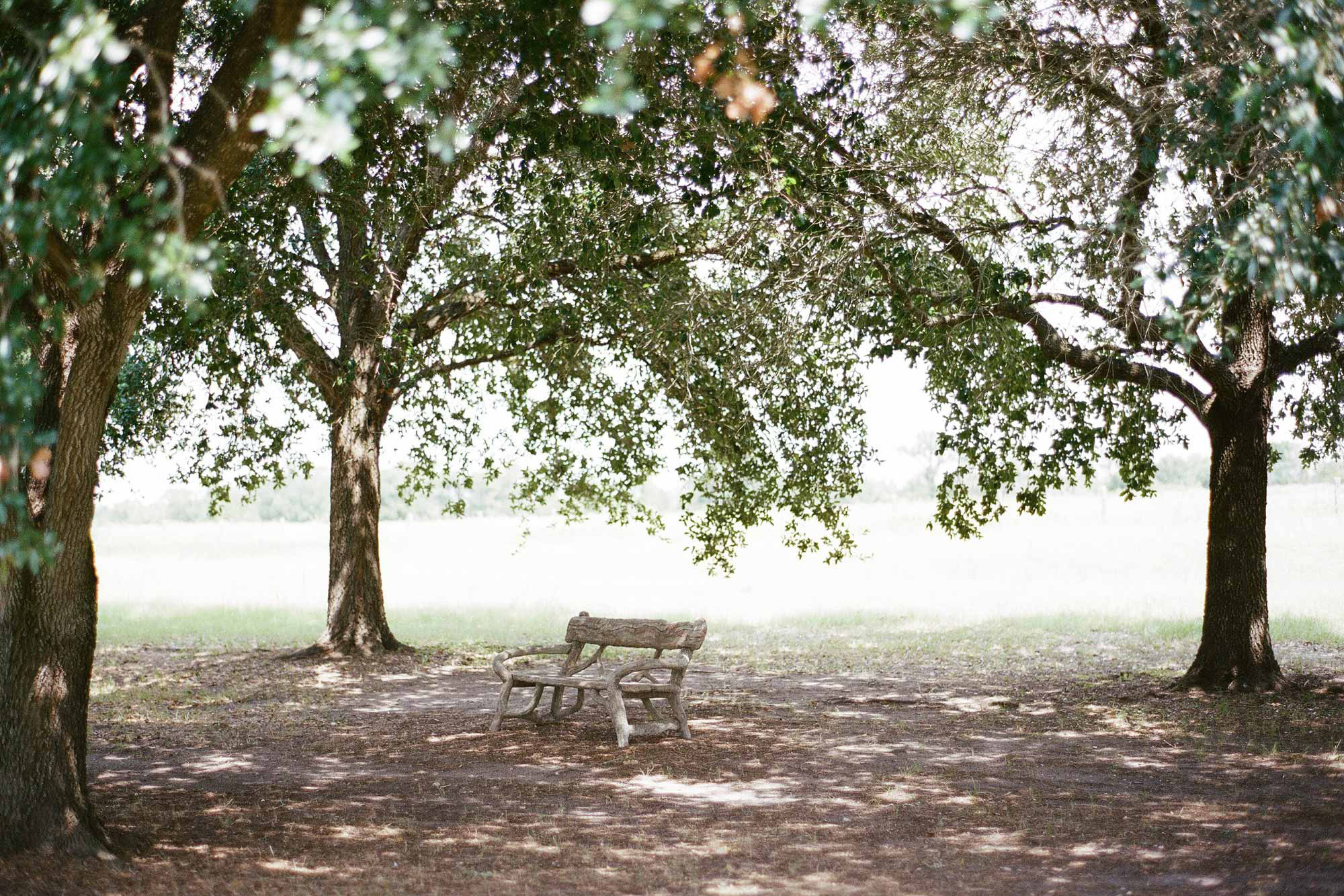
Liberty Hills is a family-owned ranch in Anderson, Texas. Enjoyed as a getaway from the Houston city for over twenty years, its abounding acreage is nearly untouched with the exception of a beautiful family house designed by the owner’s father. The ranch is a place where family and friends can feel just as free to play and get dirty out on the land as to share a meal around the grand dining table or a chat in front of the fireplace. It’s elegant but comfortable. With exciting things happening in recent years, including the start of their grass-fed meat company, Liberty Provisions, a new visual identity was needed to better represent the ranch in this new chapter.
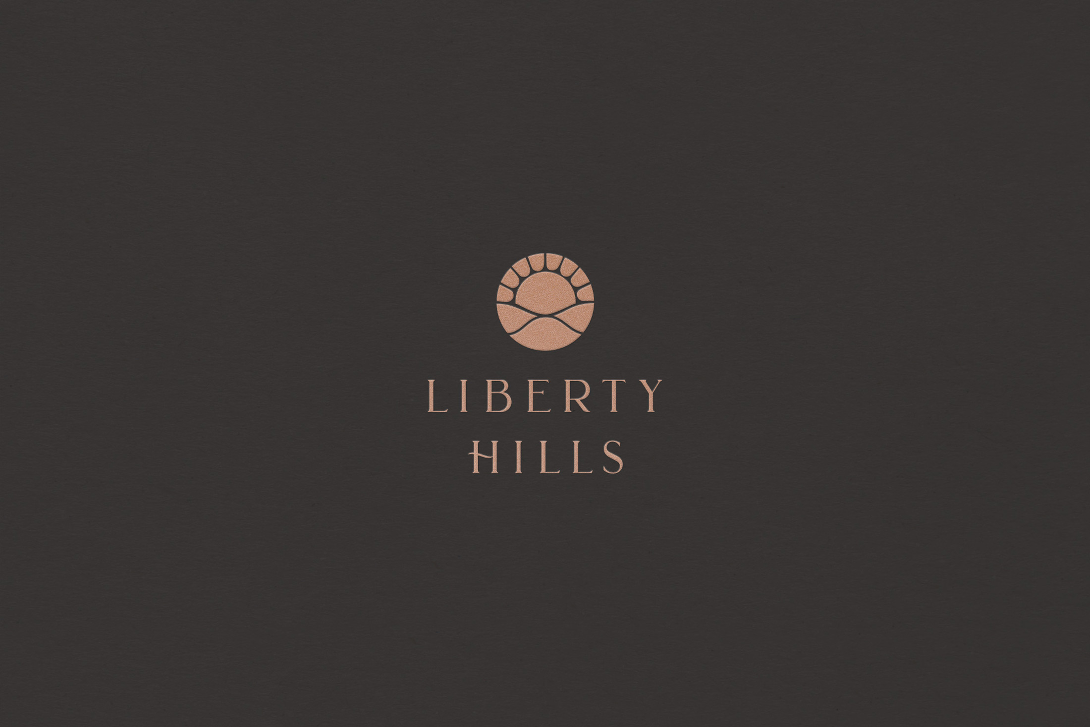
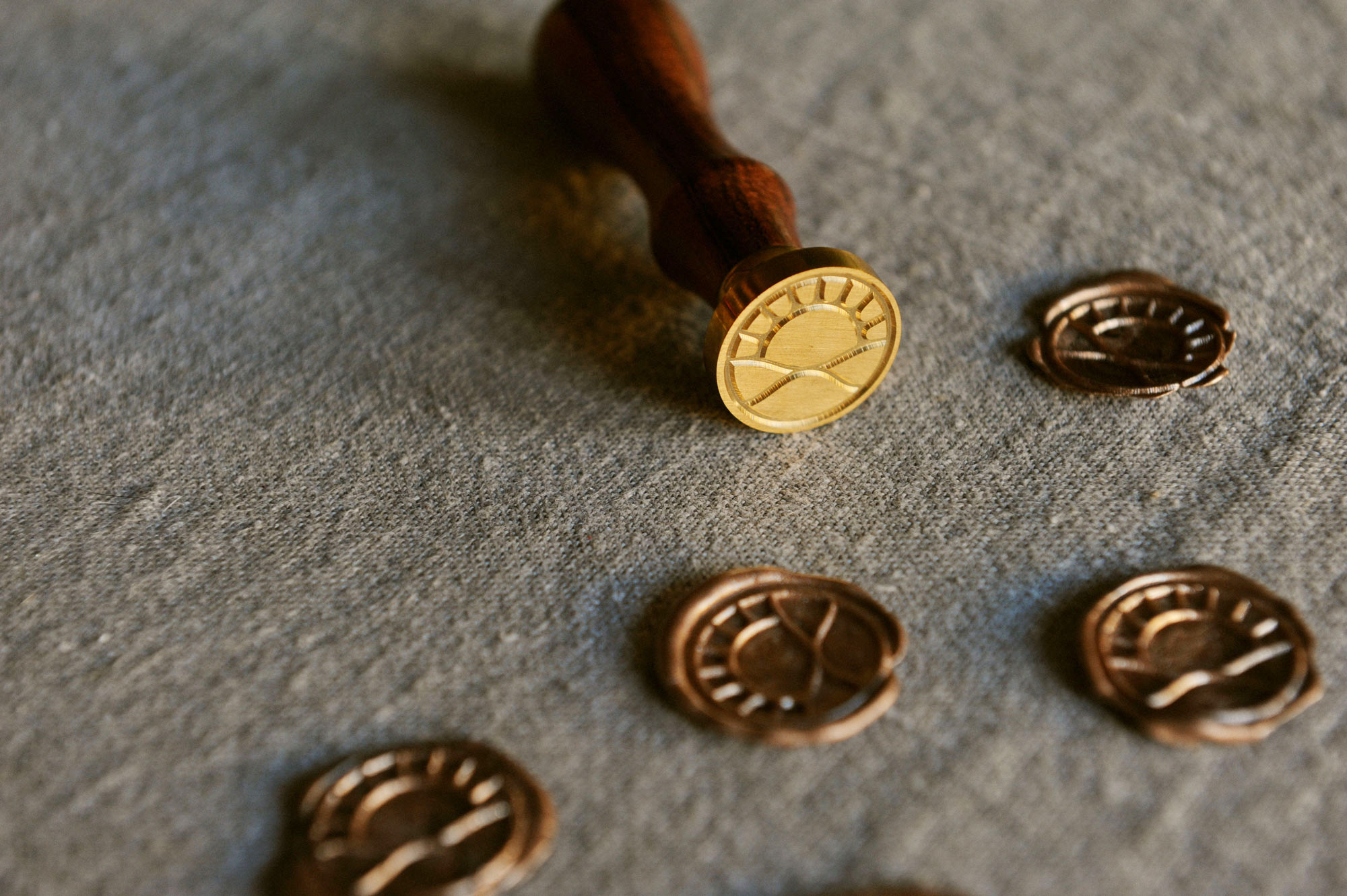
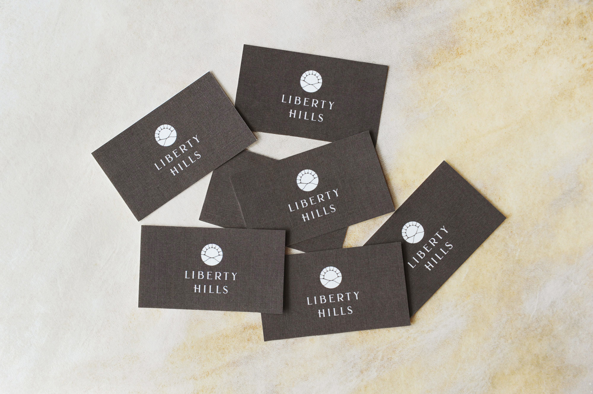
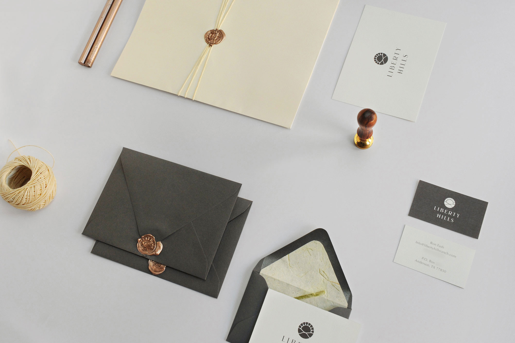
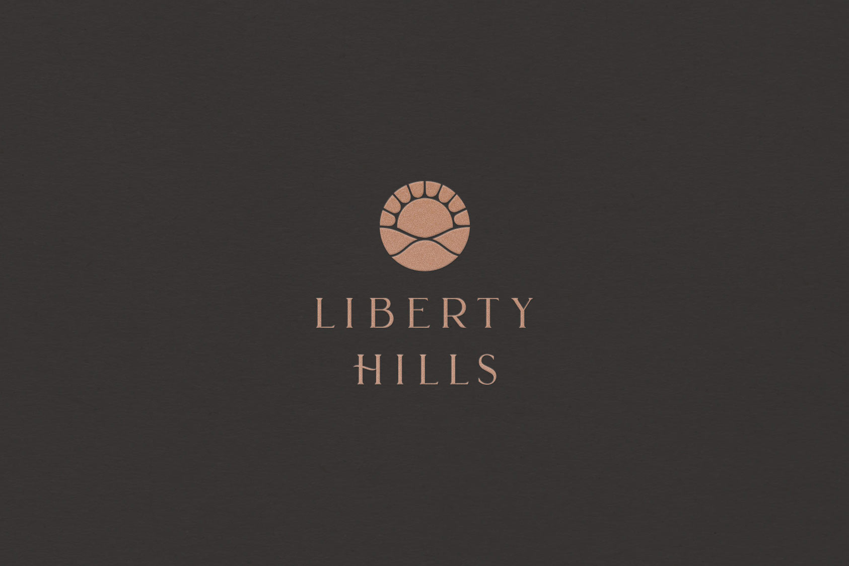
Beginning with a logo refresh, I built off the original circular mark, implementing softer lines and curves to represent the land’s rolling hills and updated typography for a more polished look. The logotype is understatedly rustic, with a custom swash forming the H in Hills.
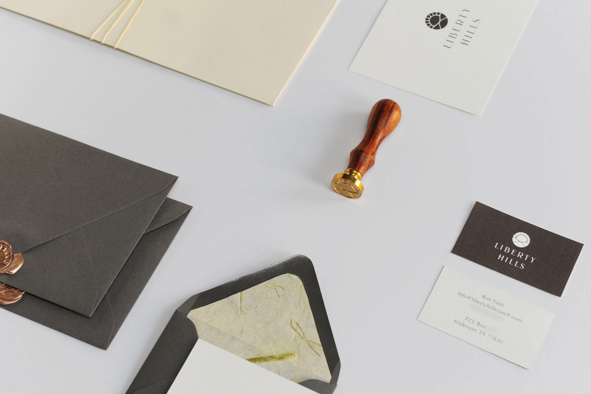
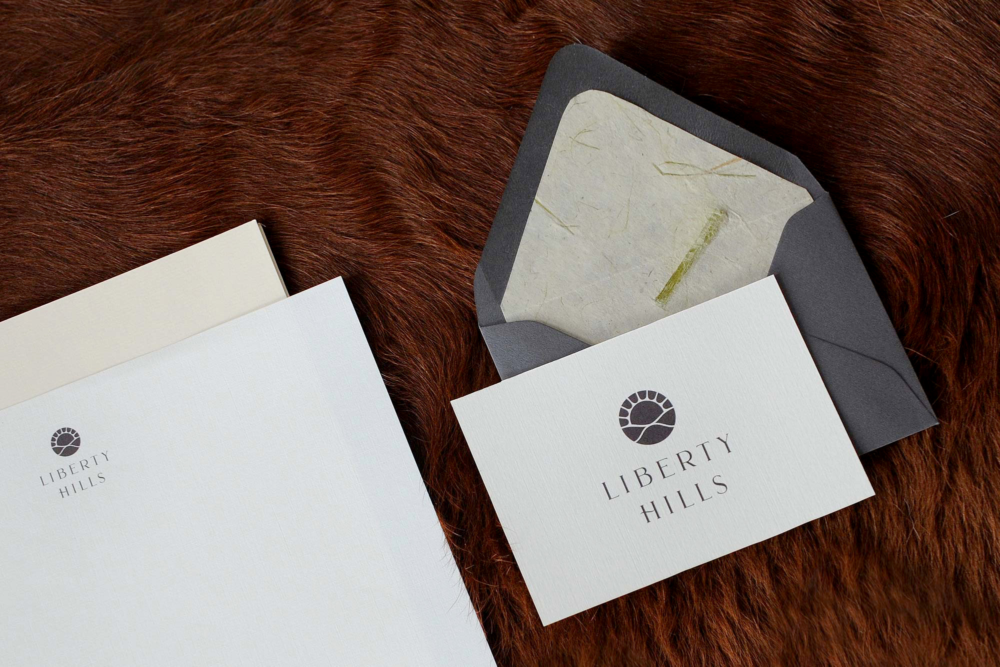
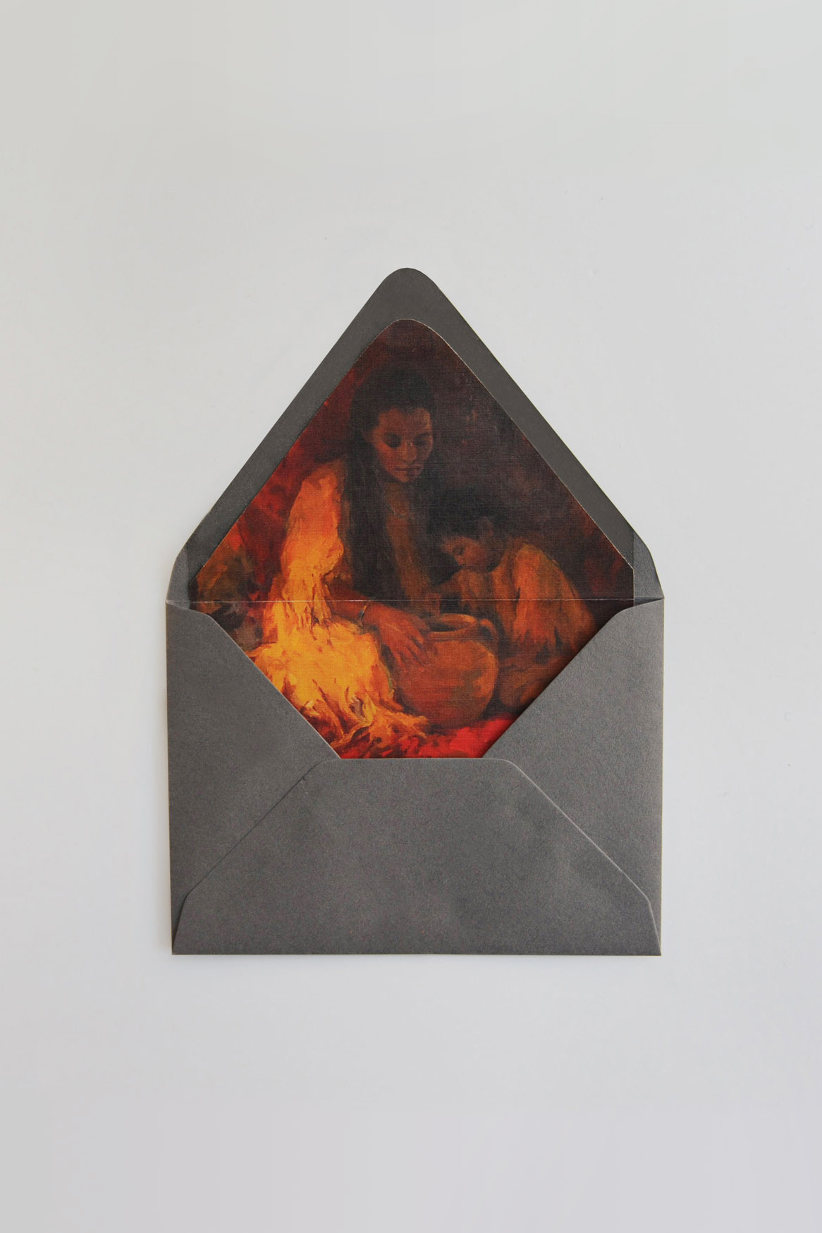
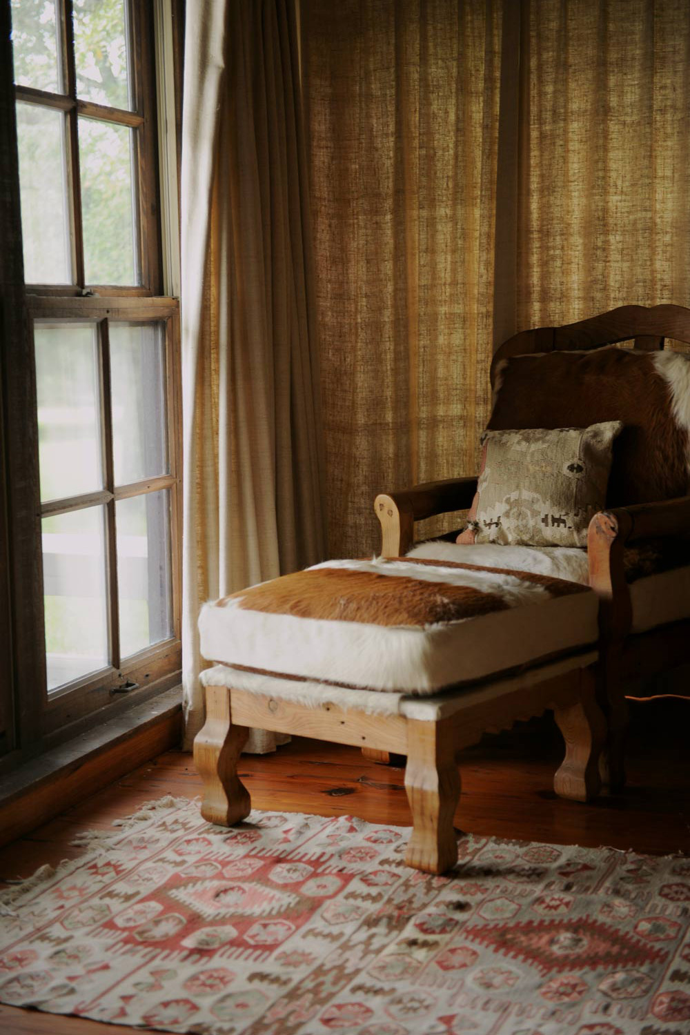
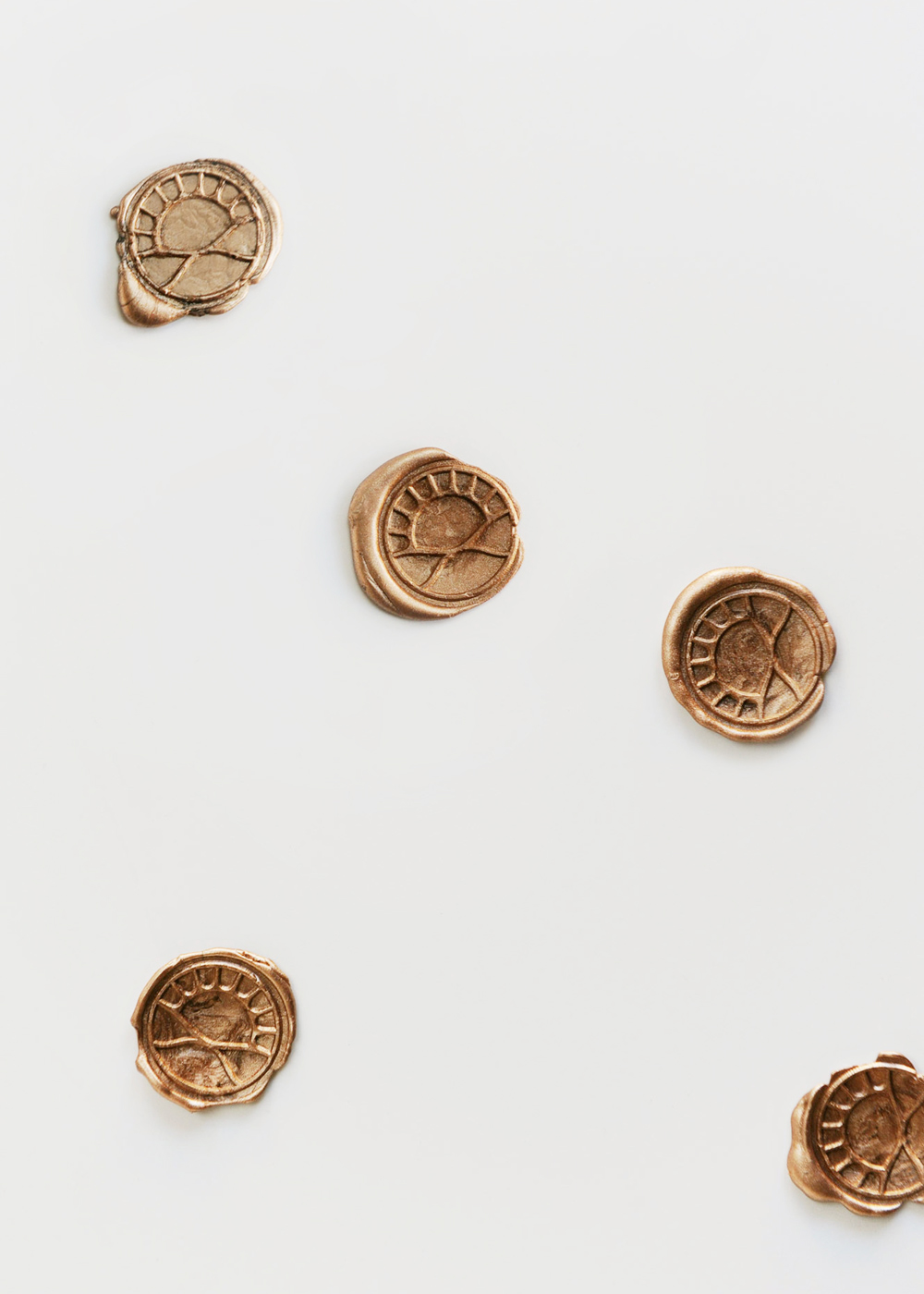
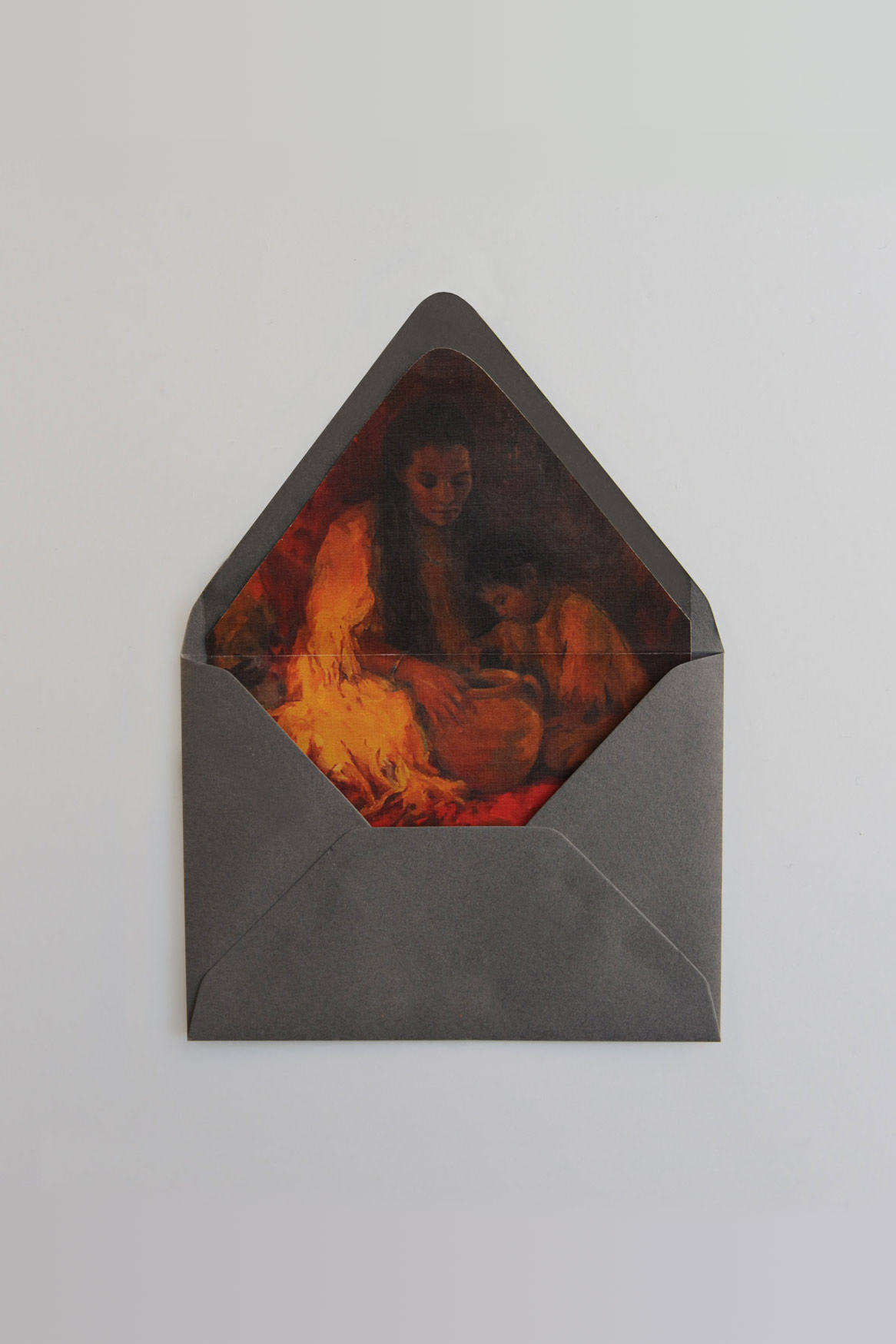
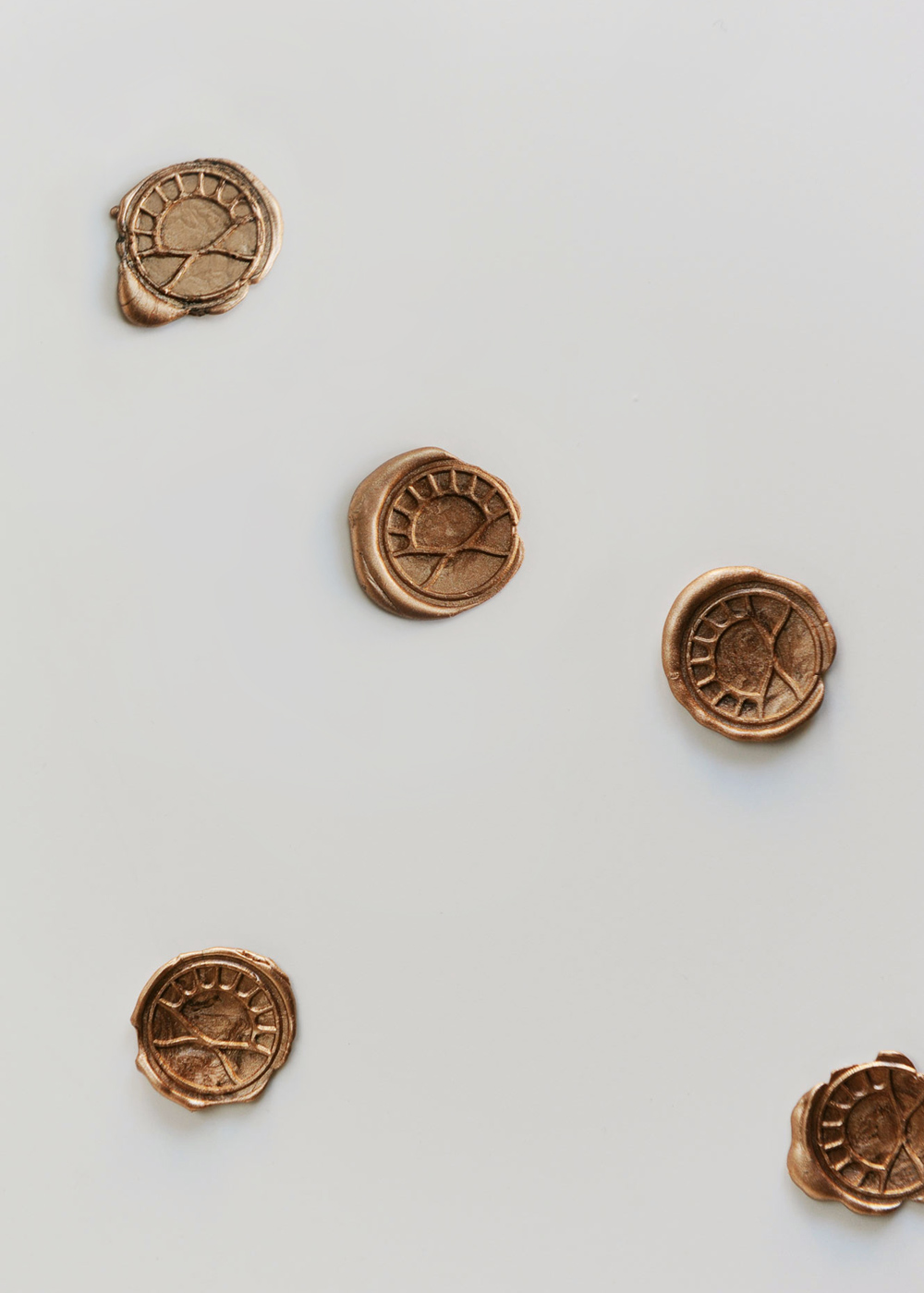
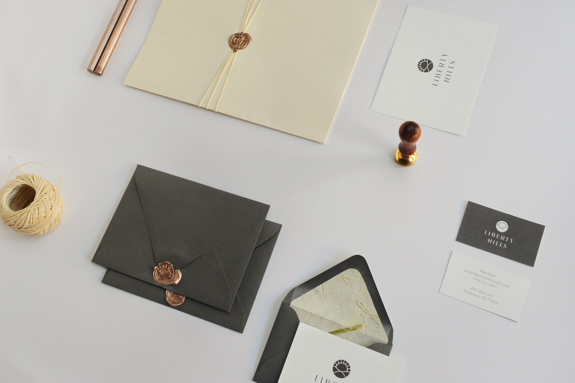
Greatly influenced by the architecture and decor of the family home and it’s surrounding land, natural textures and warm colors were chosen for a soft, romantic vibe applied across the brand, including an envelope liner of a painting hanging down one of the house hallways and a custom branded wax seal to give letters a personal touch.
Tasks
Brand Identity, Printed Materials,
Photography
Get in touch
Follow
Copyright Sara L. Walker
Liberty Hills Ranch
Liberty Hills is a family-owned ranch in Anderson, Texas. Enjoyed as a getaway from the Houston city for over twenty years, its abounding acreage is nearly untouched with the exception of a beautiful family house designed by the owner’s father. The ranch is a place where family and friends can feel just as free to play and get dirty out on the land as to share a meal around the grand dining table or a chat in front of the fireplace. It’s elegant but comfortable. With exciting things happening in recent years, including the start of their grass-fed meat company, Liberty Provisions, a new visual identity was needed to better represent the ranch in this new chapter.
Beginning with a logo refresh, I built off the original circular mark, implementing softer lines and curves to represent the land’s rolling hills and updated typography for a more polished look. The logotype is understatedly rustic, with a custom swash forming the H in Hills.
Greatly influenced by the architecture and decor of the family home and it’s surrounding land, natural textures and warm colors were chosen for a soft, romantic vibe applied across the brand, including an envelope liner of a painting hanging down one of the house hallways and a custom branded wax seal to give letters a personal touch.
Tasks
Brand Identity, Printed Materials,
Photography






Get in touch
Copyright Sara L. Walker.


